DRIVE SHACK

DISCIPLINE: Menu Design
CLIENT: Drive Shack
DESIGN GOALS:
Create eye catching temporary menu.
Create a menu that attracts new and existing customers that entices them to try our food.
Make the menu clean, easy to read and modern.
SOLUTIONS:
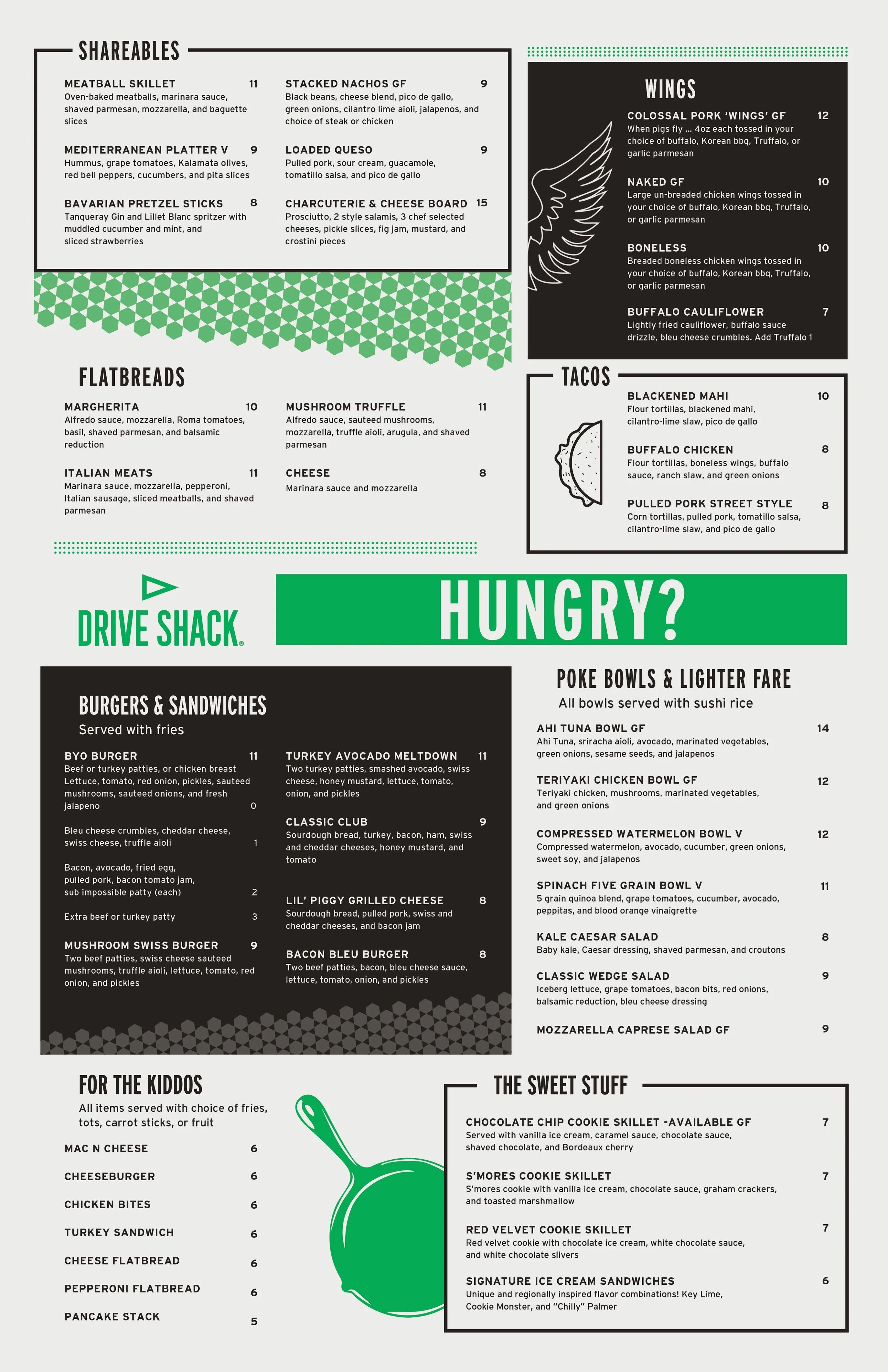
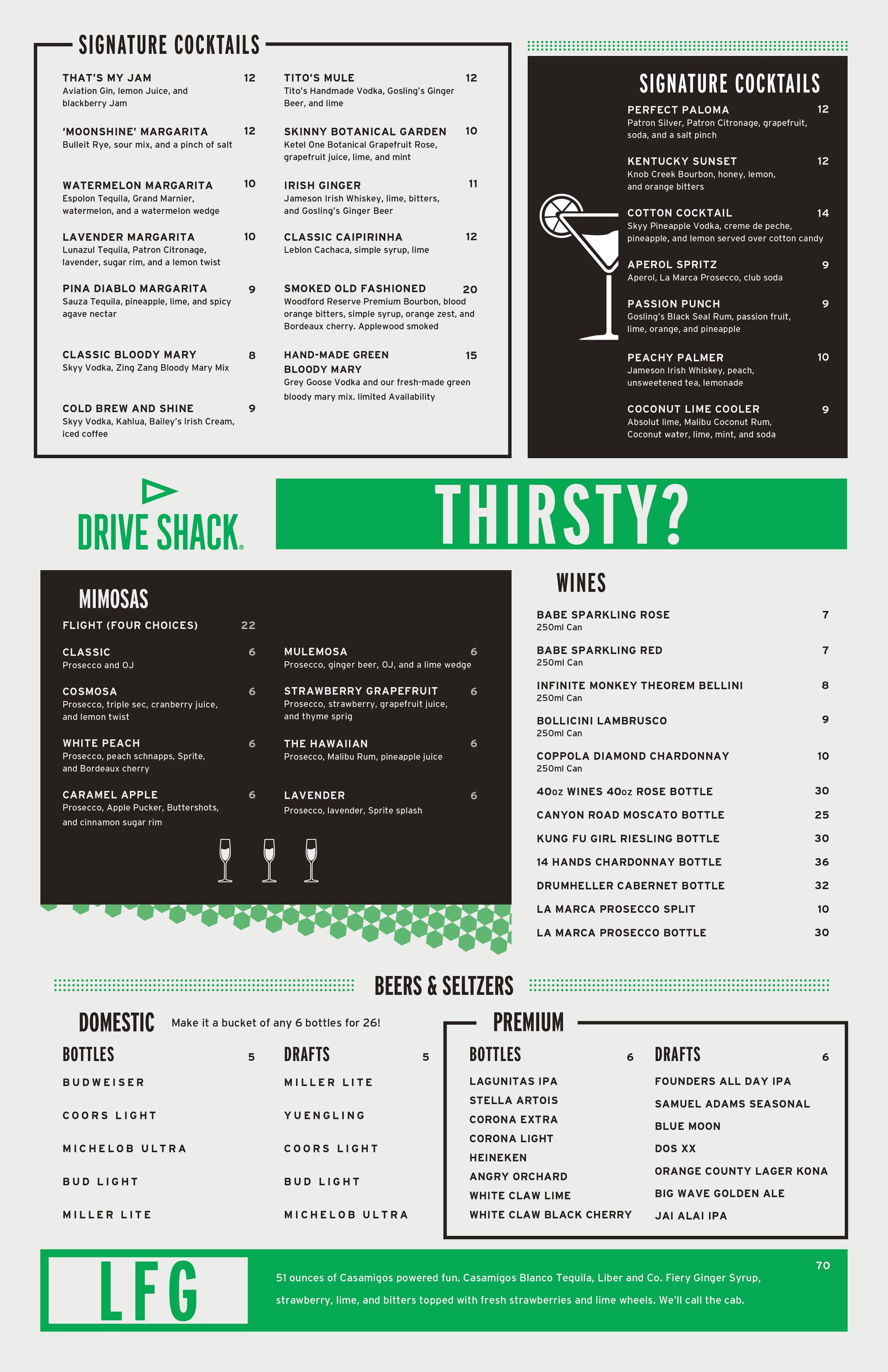
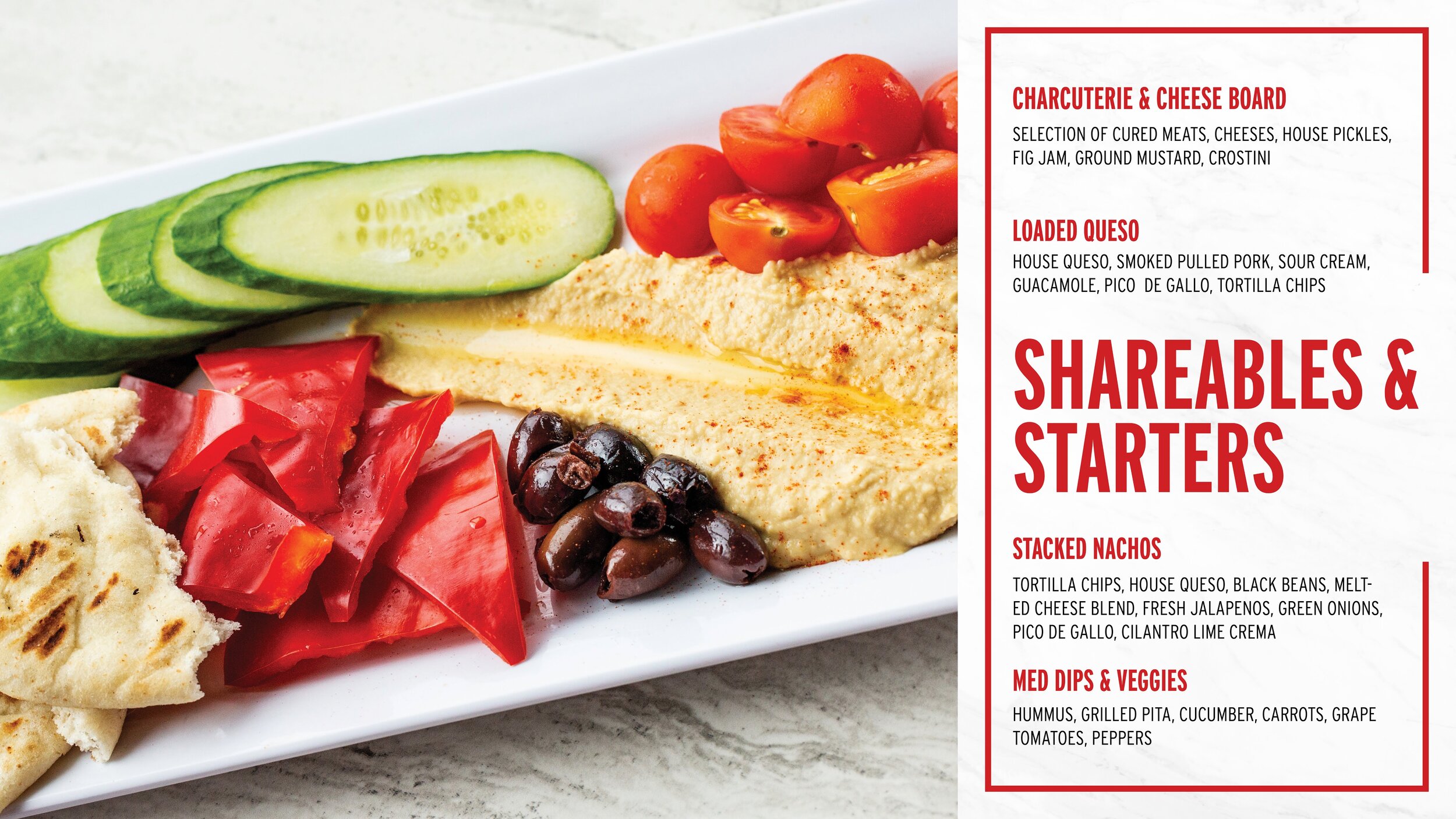
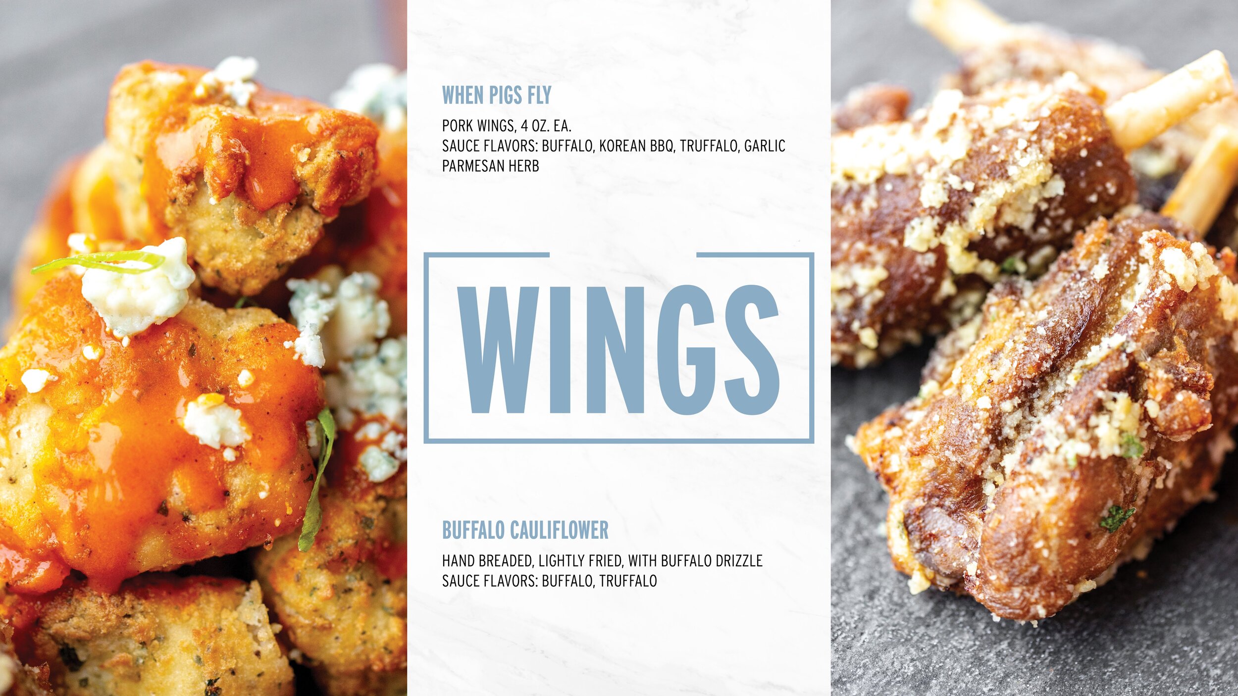
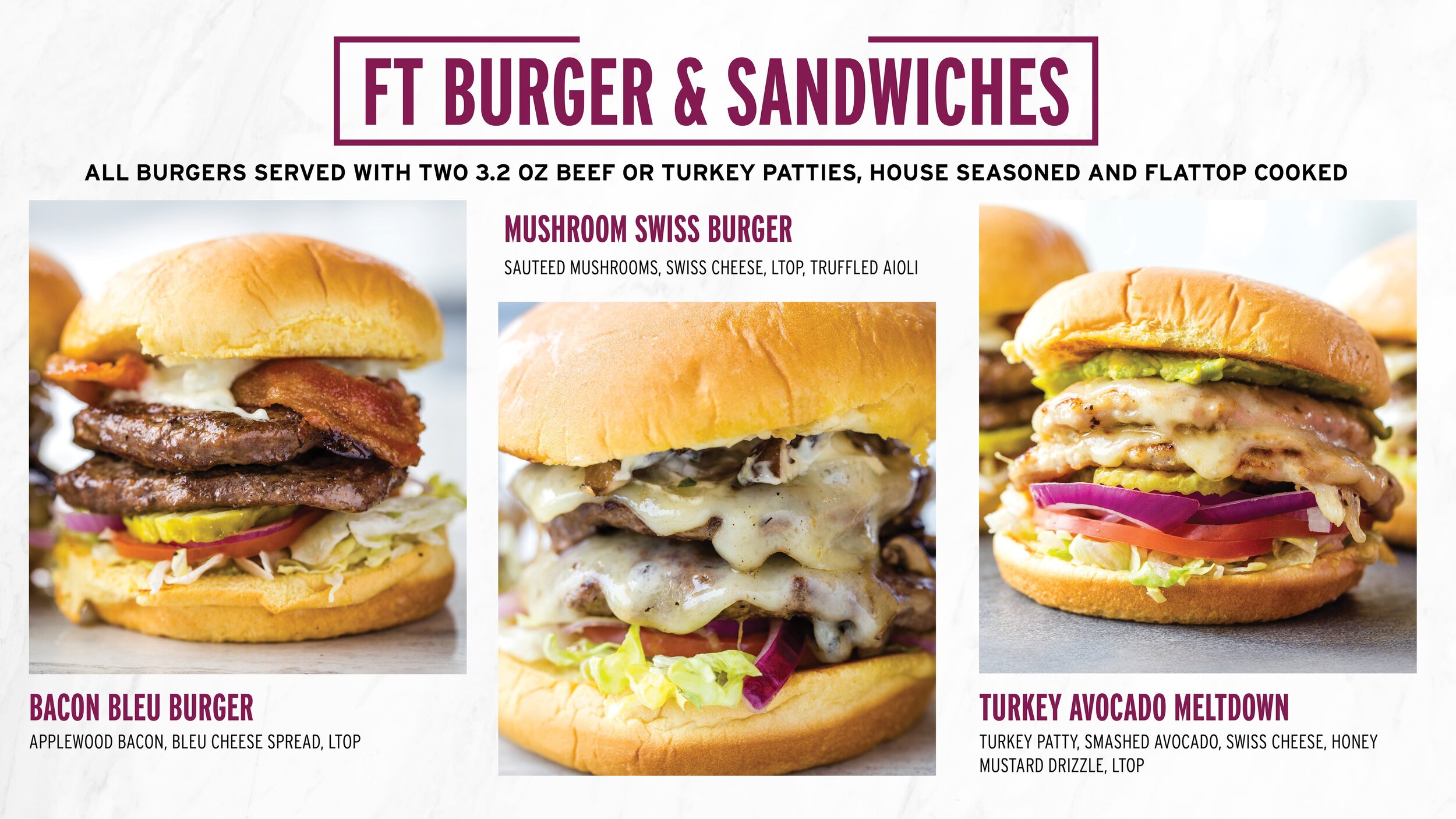
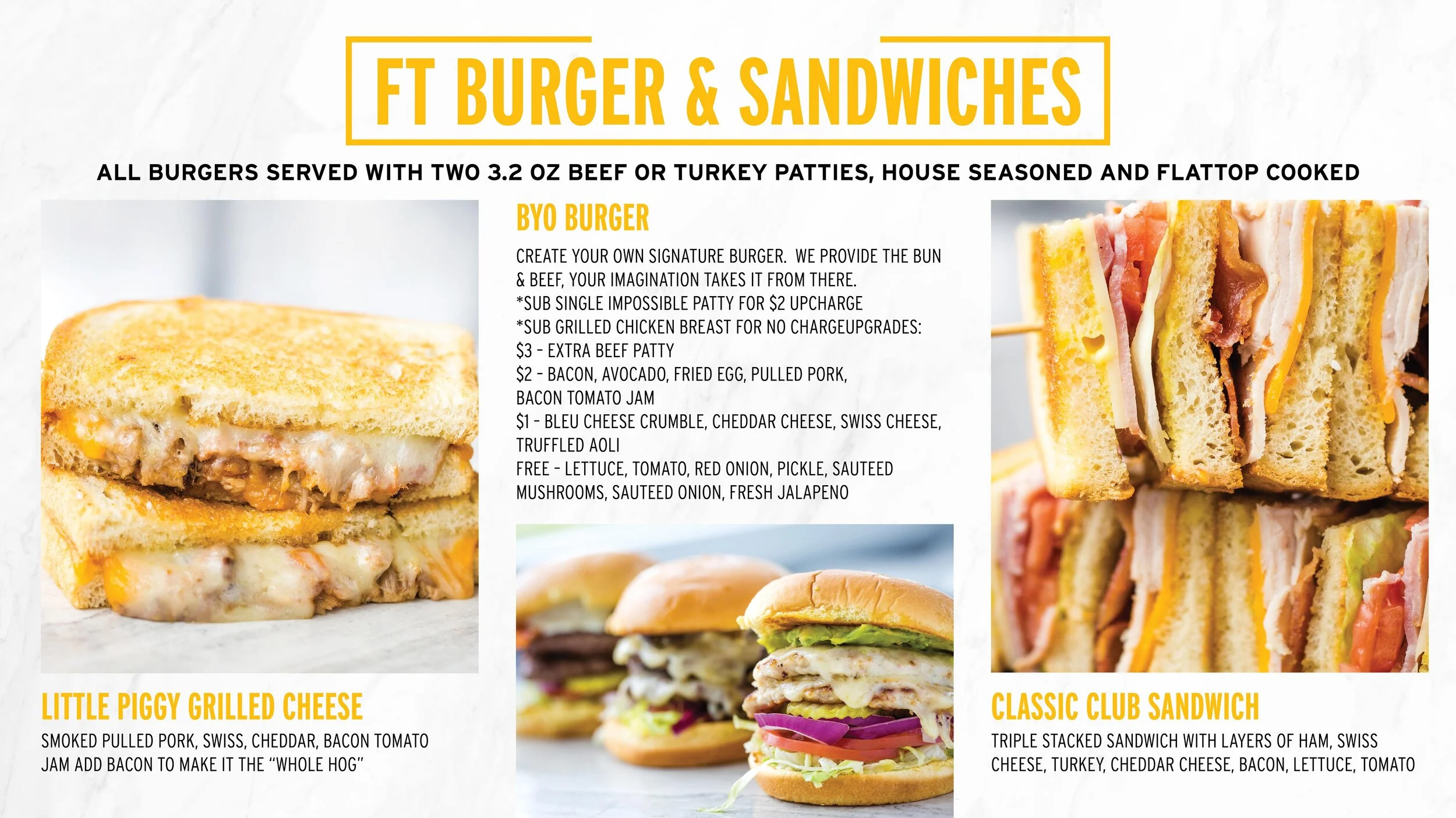
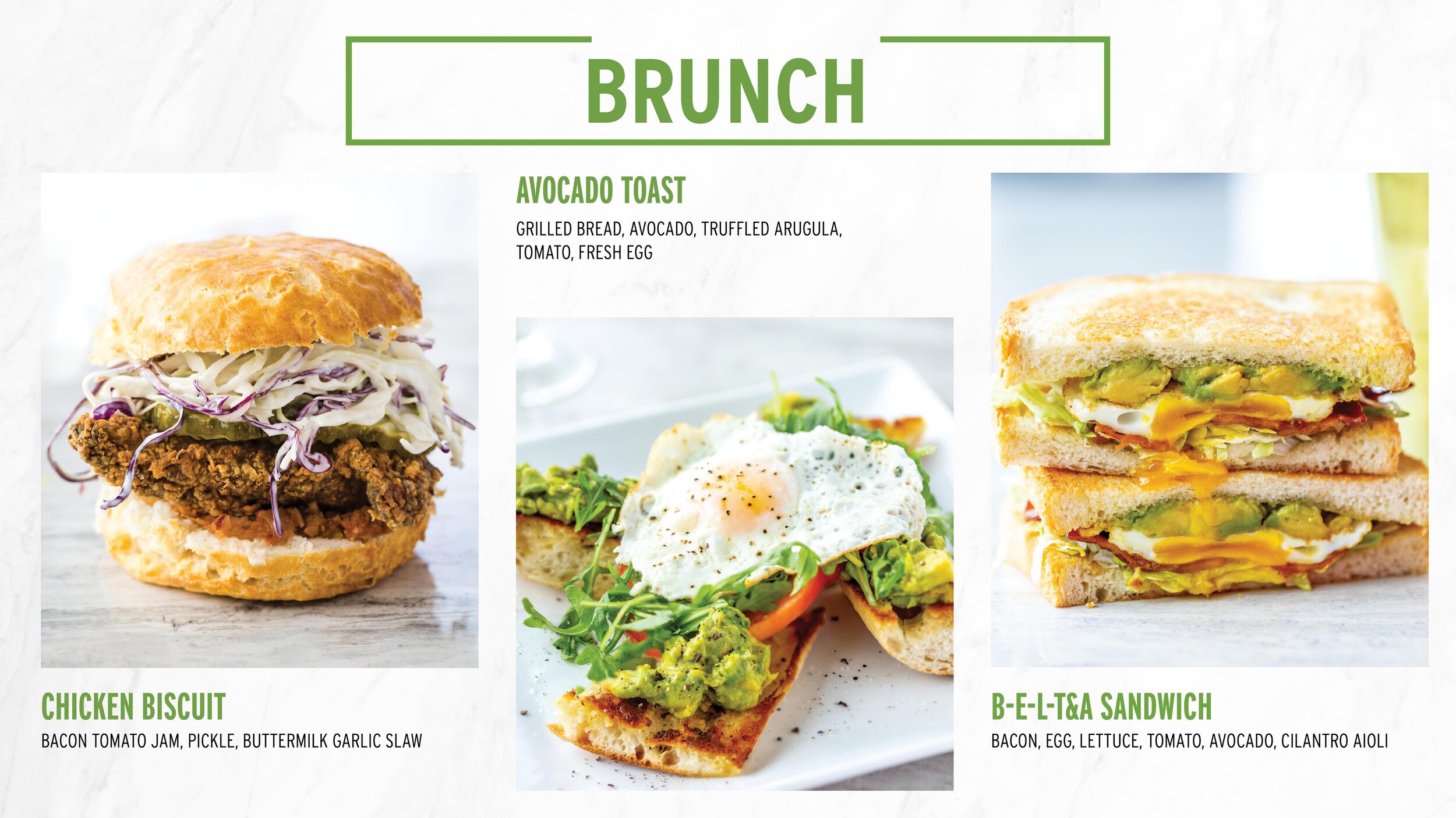
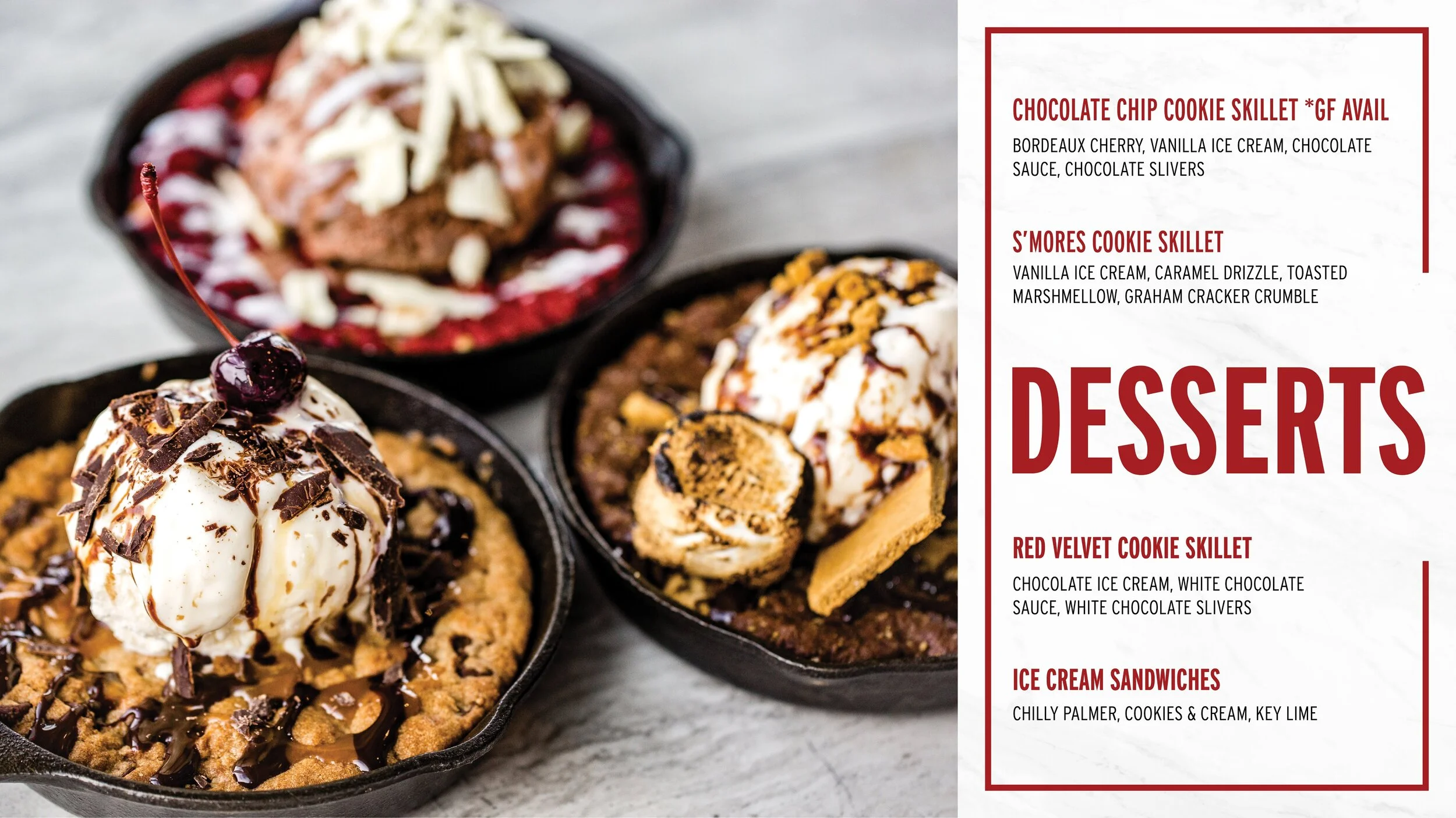
One of the first projects I had at my job at Drive Shack was creating a temporary menu. Drive Shack had created a new menu and there was a gap of time in between now and when the new menu would roll out. I was tasked to create a menu in a day so it could be printed that day to hold over the venue until the offical menus arrive. I used existed Drive Shack branding guidlines with the fonts and layouts to keep the branding consistant. I had created a bunch of new icons a few weeks prior and I was able to use some of them on the menu. The others I had to create on the spot. It was nice to try and simply the menu items down to a few icons. I played with the negative space of the brown boxes and the outlines. I used existing Drive Shack shapes and lines to play off of the open spaces in the menu. The off white menu flows with the off black (brown) boxes. The simple color scheme and icons allow the reader to focus on the various menu items we have to offer. These menus were printed on plastic sheets and are a great addition to my portfolio.

DISCIPLINE: Powerpoint Design
CLIENT: Drive Shack
DESIGN GOALS:
Create eye catching Power Point to showcase the new Drive Shack Menu.
Create a powerpoint to teach associates the ingredients of the menu.
Make the powerpoint template easy to turn into a screen to showcase the new menu to customers.
SOLUTIONS:
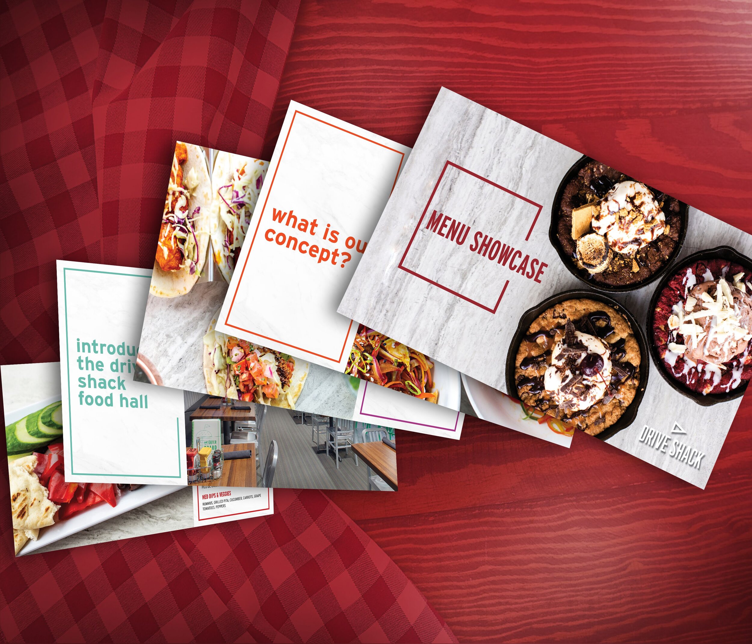
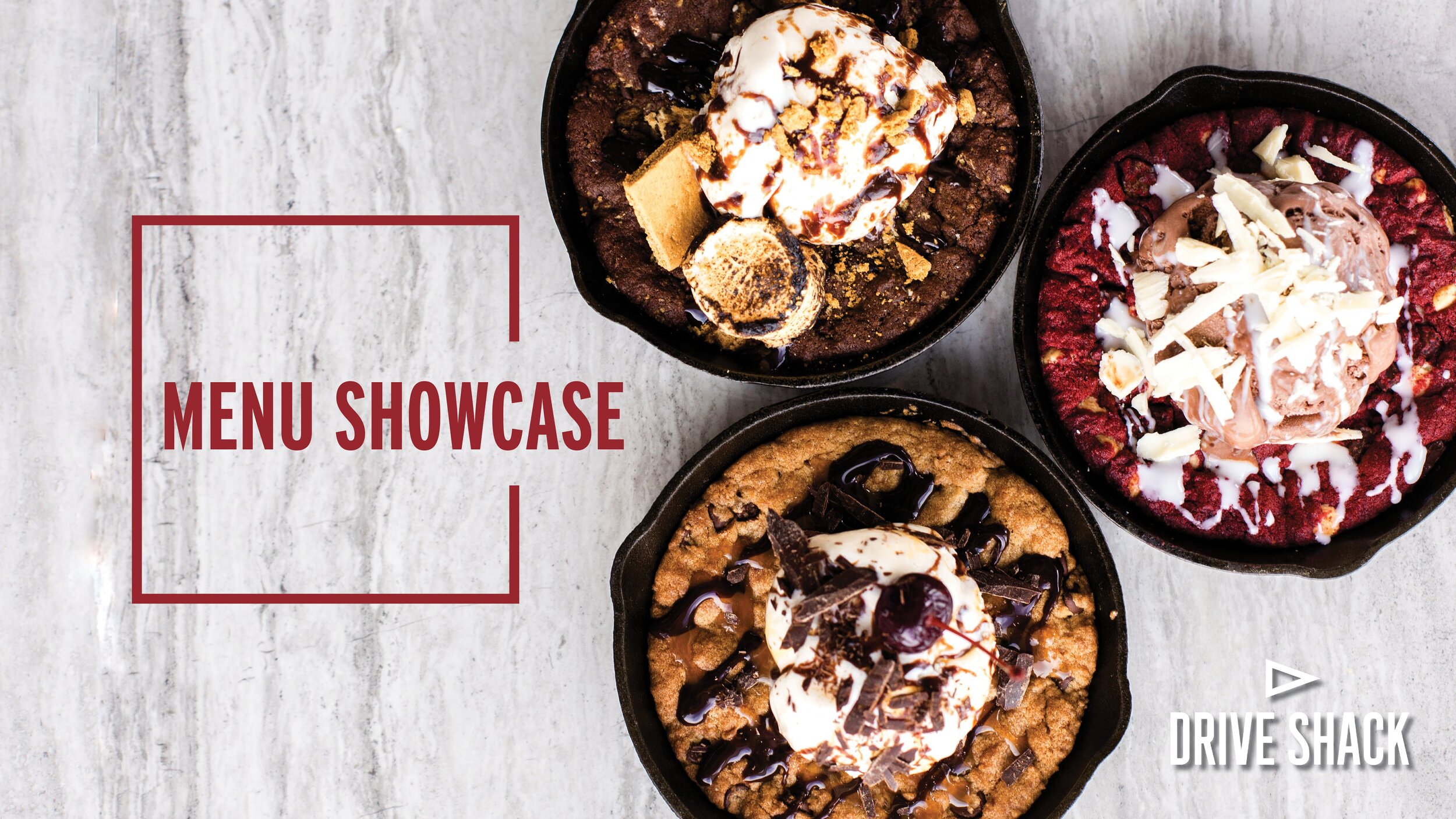
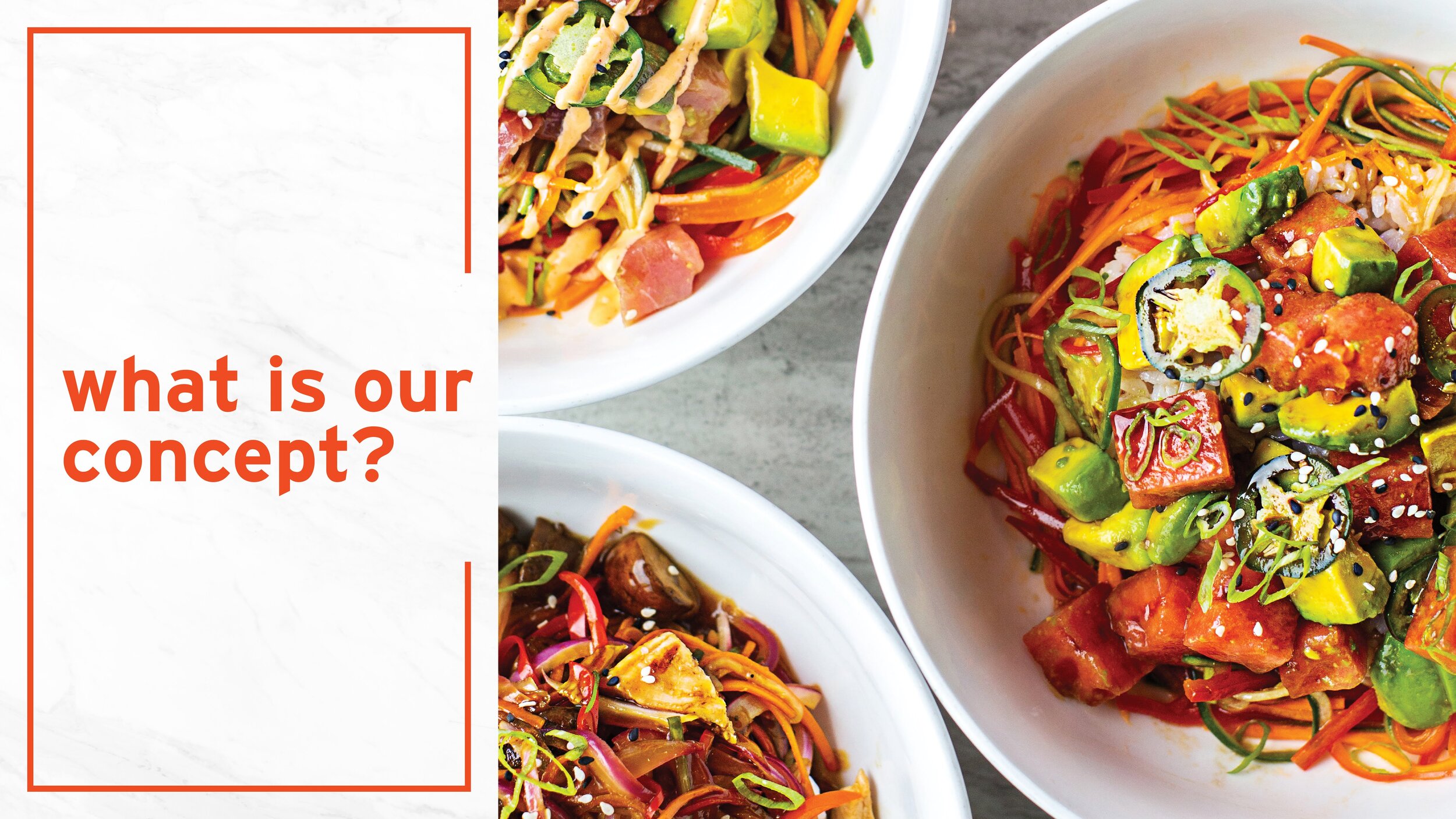
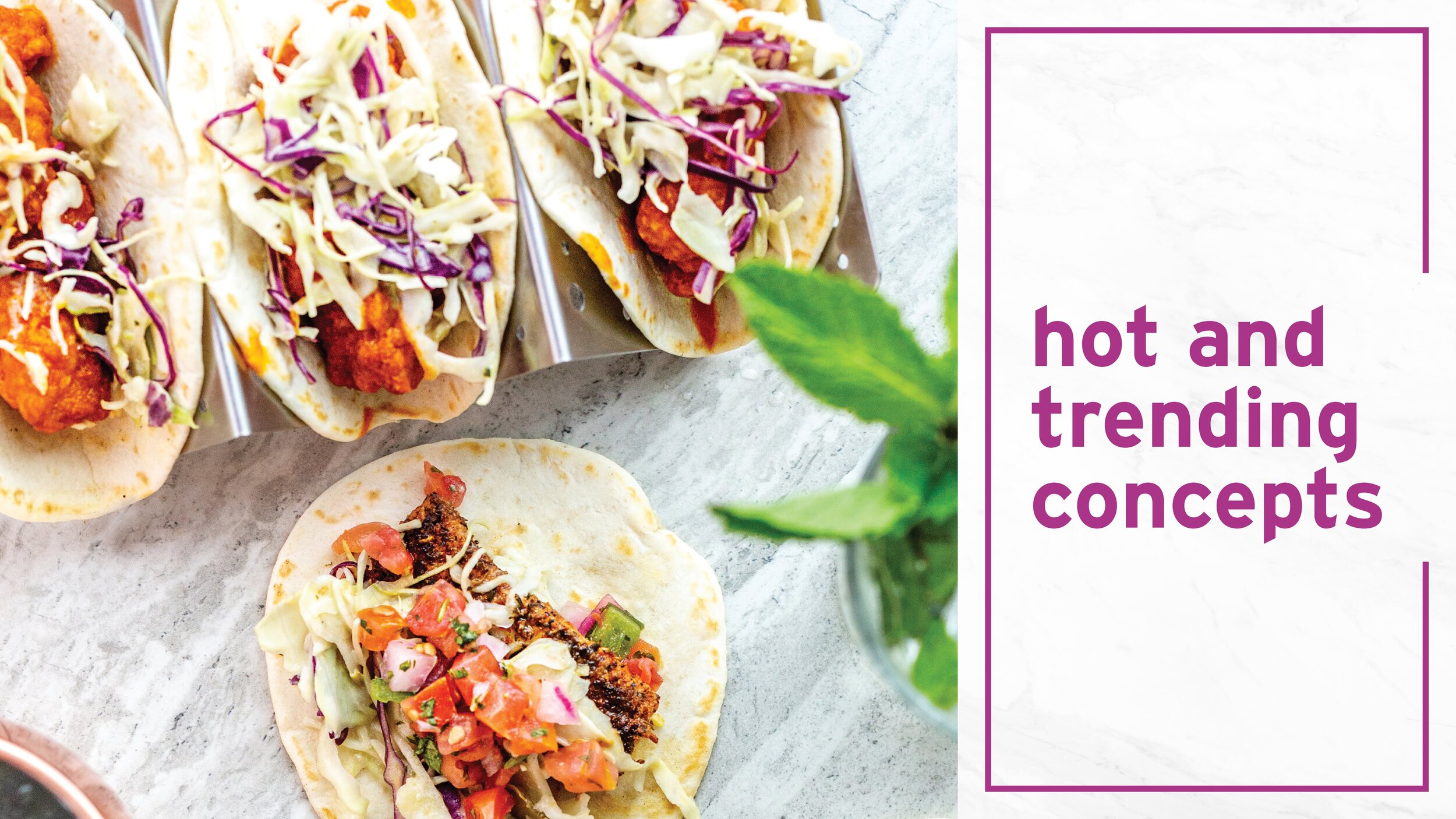
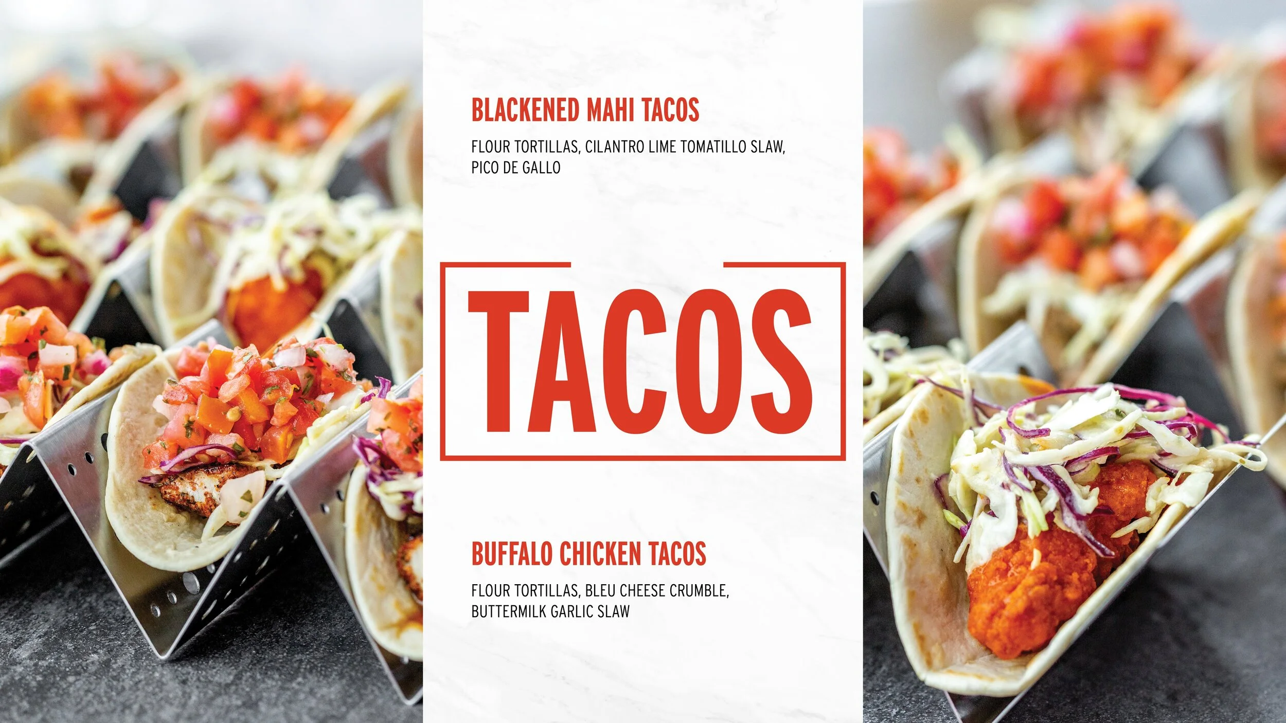
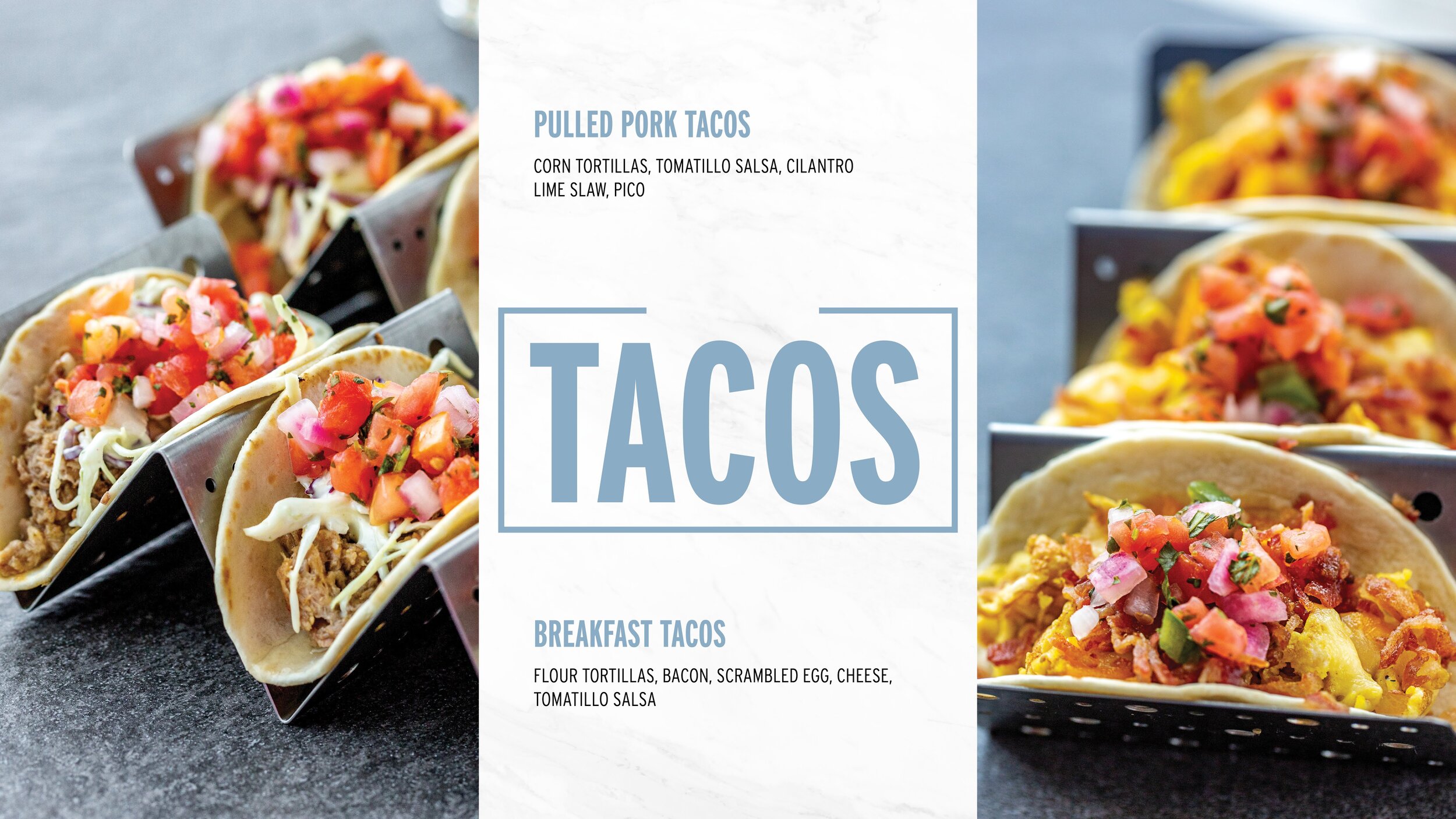
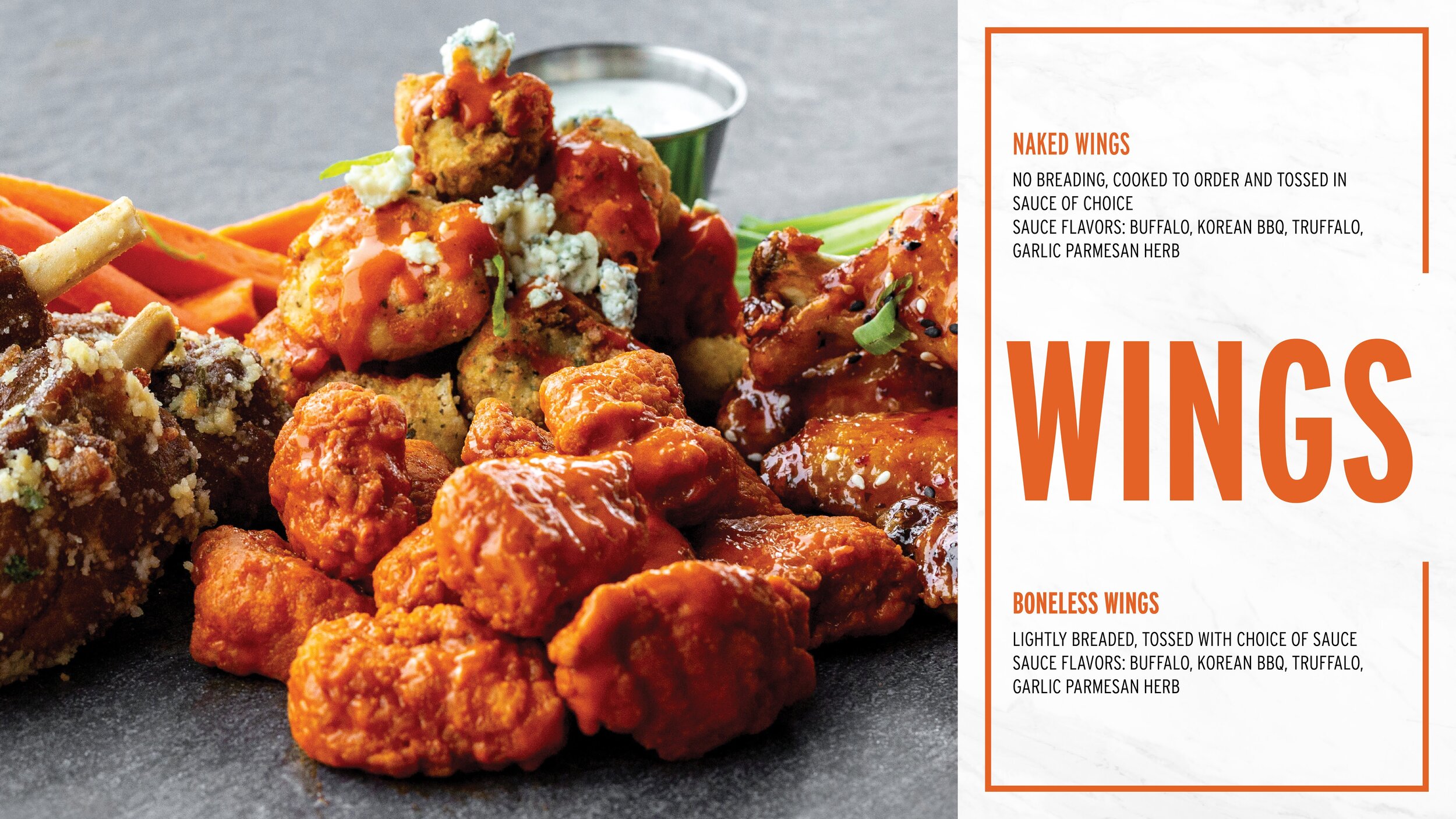
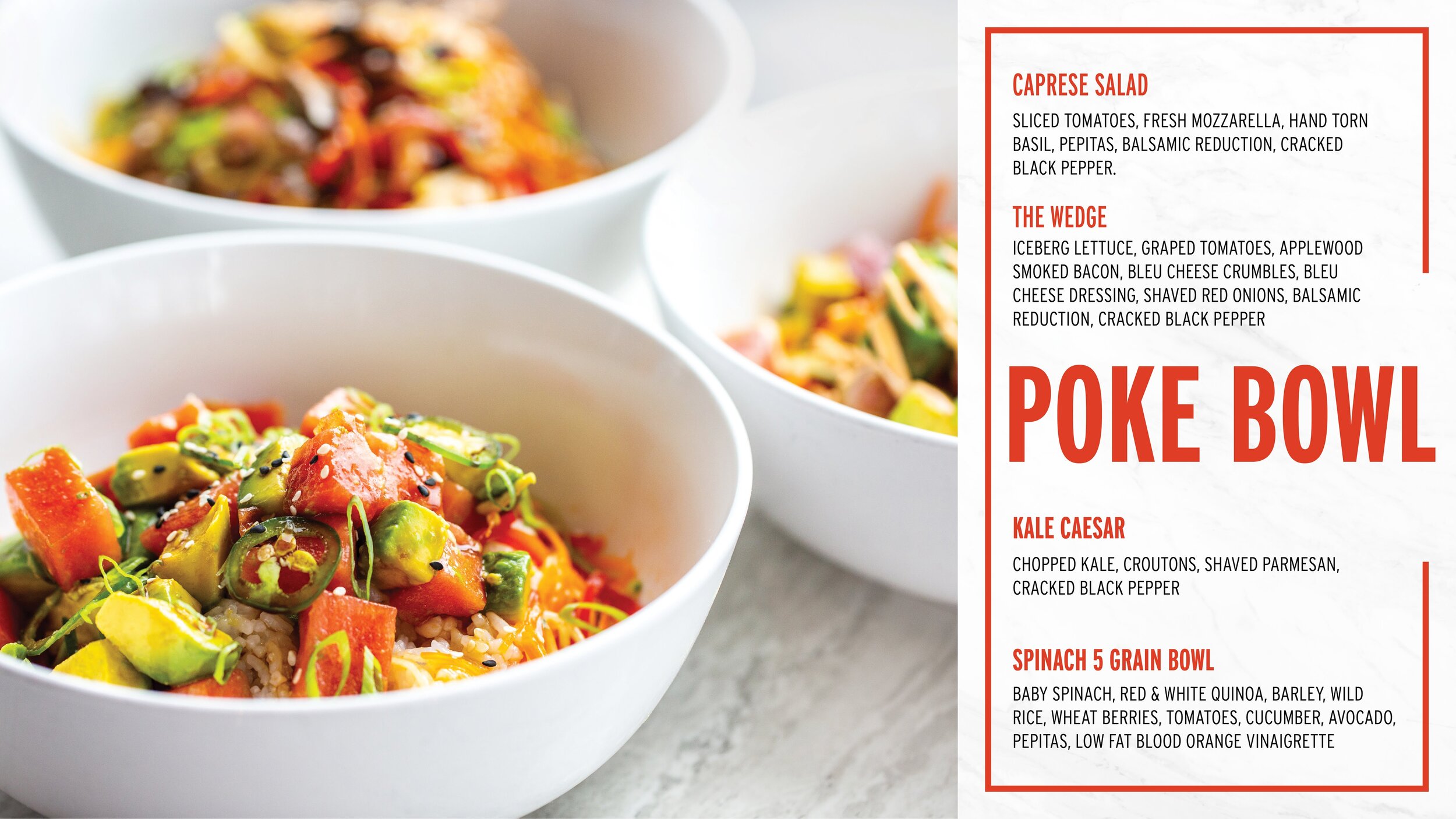
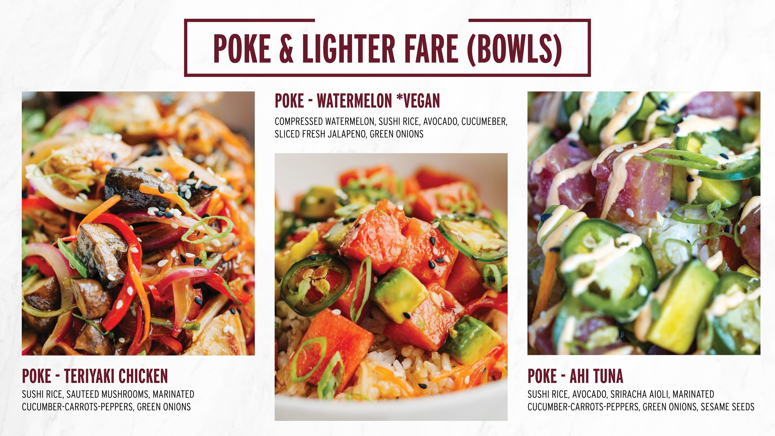
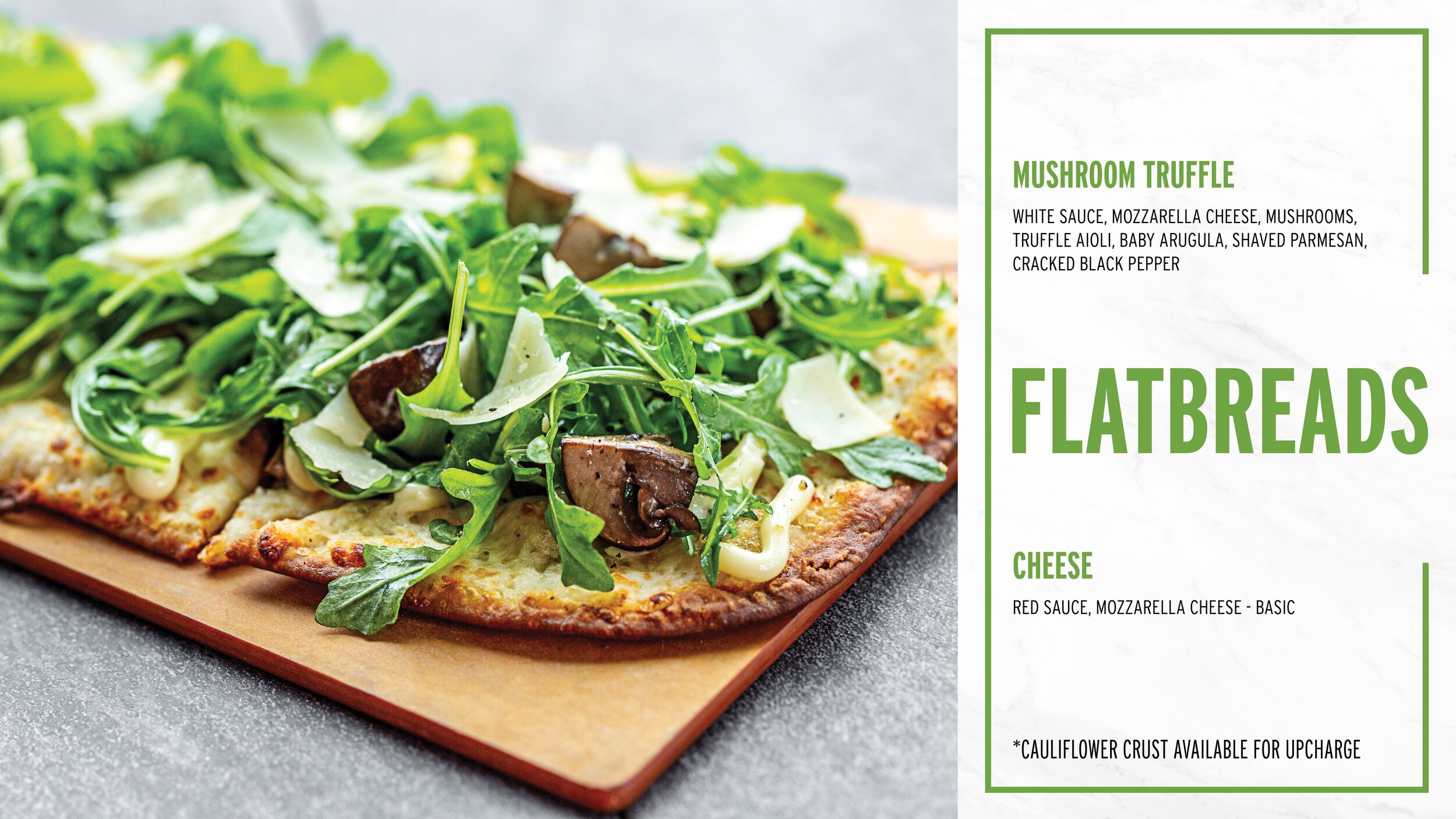
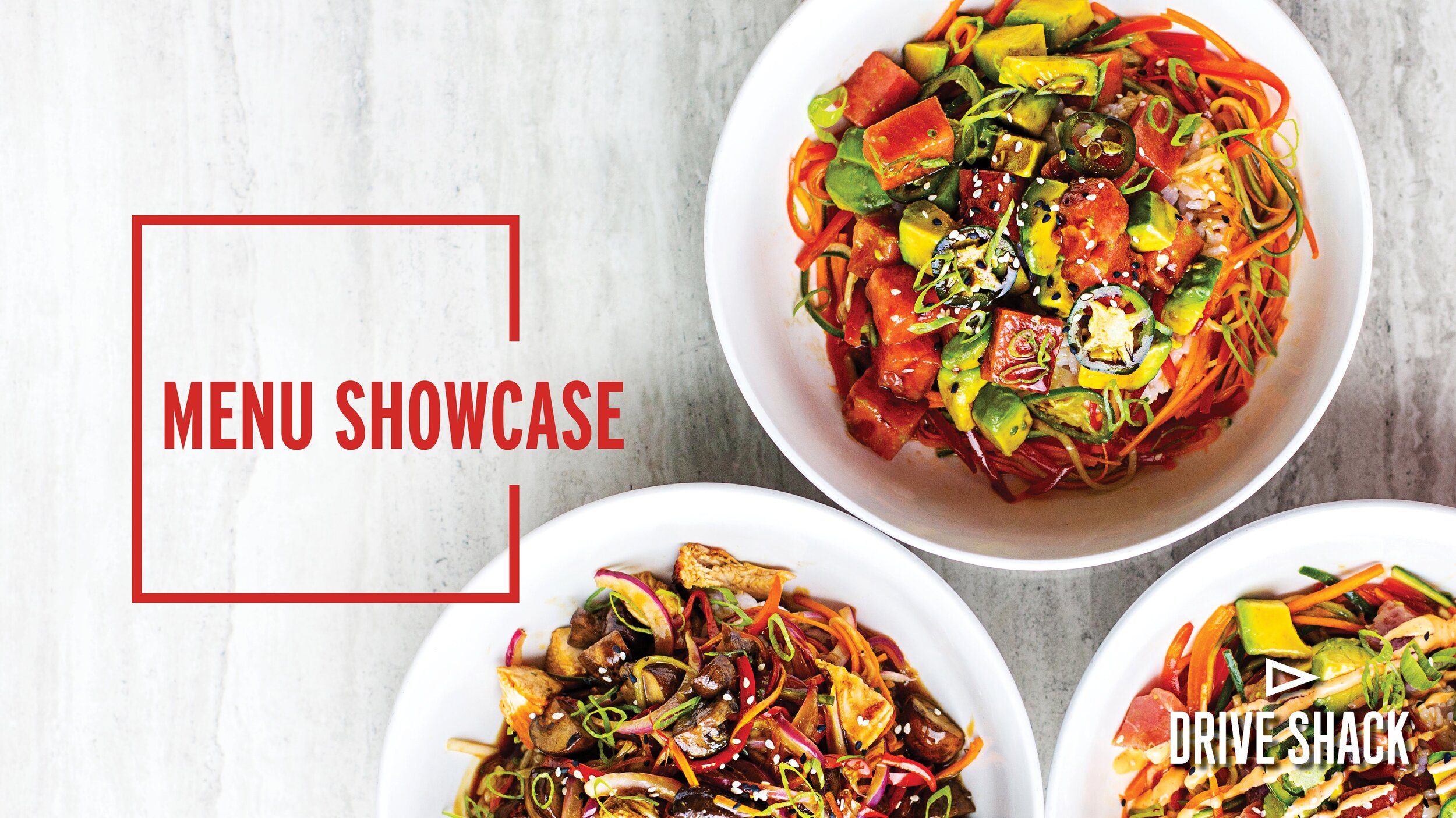
A month or so later we finally had the new menu and when the new menu comes new training. It was my task to create a menu showcase presentation to teach new associates the new menu items. I designed the slides in indesign and transfered them to powerpoint upon completion. This allowed me to use my design software and skills in Adobe rather than powerpoint. I played with the fonts to showcase the new dining halls and menu times. I selected bright colors featured in the various menu items. This made the fonts pop with a hint of color the mimiced our great food, paired with some amazing food photography made these powerpoints feel fresh, crisp and modern just like our menus. It was amazing to see the associates learn from this powerpoint when I attended one of the training events in Orlando. Our senior designer used this as a template to build menus to go on the gamepads around the venues to show the new mouthwatering meal options.


DISCIPLINE: Allergy List Design
CLIENT: Drive Shack
DESIGN GOALS:
Create eye catching allergy list.
Create a list that is easy to use so customers and associates know which foods have which allergies.
Make the list clean, easy to read and modern.
SOLUTIONS:
After the menu showcase was created I was tasked to create a allergen list. The previous was just boring Arial font on a white page. This had to be spruced up. I used the same font treatment as the Menu Showcase PowerPoint. Sticking with the same branding i used bright and vibrant colors of the menu to categorize the different food groups. I wanted the list to be easy to read so that if a guest has a fish allergy the associate could easily look on the list immediately see the fish category and check if the item was on the list. Once of the challenges of the was fitting a 12 page menu down on one sheet. I kept it simple and reserved the space for the text. The large category text easily draws the reader in to easily identify each group. This was a great piece to add to the portfolio and I’m glad to see how my ideas from one project can flow into the next!

DISCIPLINE: Instructional Training Design
CLIENT: Drive Shack
DESIGN GOALS:
Create eye catching trainings for Drive Shacks La Marca bottle service and retail wall setup.
Create a design that teaches associates how to set up the bottle service and retail wall.
Make the instruction clean, easy to read and modern.
SOLUTIONS:
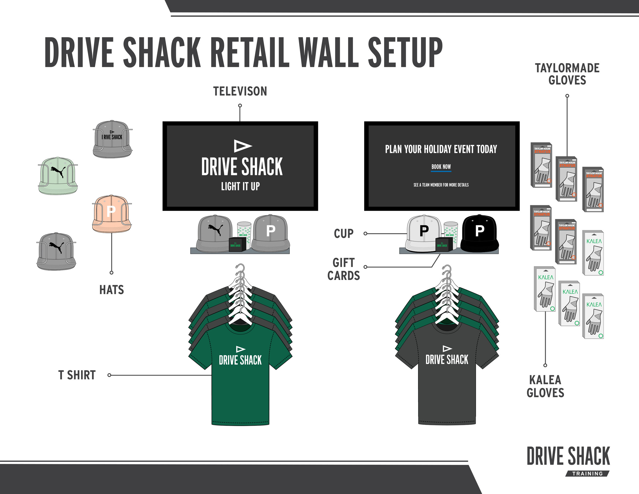
These two instructional training designs were ment to be tutorials or cheatsheets on how to set up the La Marca Bottle service and retail wall. Both use the Drive Shack Brand Guidlines and color scheme. They both feature one of my favorate areas of design, illustration. I had alot of fun simplifing and drawing the La Marca bottles and retail items in illustrator. I wanted the icons to be simple but still reflect the items detail. The retail wall setup shows the layout of the retail wall and where each item goes. It is a guide that goes on the retail cashiers desk and shows them how to restock and set up the wall. My favorate part was illustrating the T-shirts and caps. I aslo had fun illustration the La Marca bottles and glasses. Just simply applying their logo makes the products feel that much more authentic.


DISCIPLINE: Instructional Training Design
CLIENT: Drive Shack
DESIGN GOALS:
Create eye catching tutorial on how to Seat on a Wait.
Create a tutorial to fit in the associates POS system and desk.
Make the tutorial clean, easy to read and modern.
SOLUTIONS:
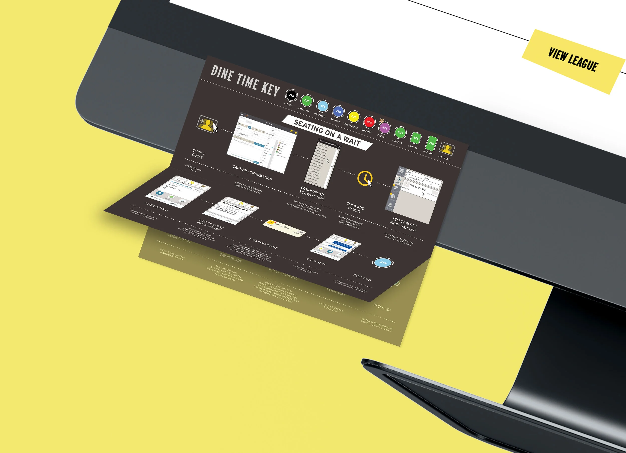
When creating this instructional tutorial I thought about the space in which it would exist. I wanted something simple and easy to follow. Since our seating is done on a computer I thought of a monitor sheet. I wanted it simple and to only be one sheet. A experienced designer thinks of printouts as a 3D object and how that paper can be folded. I used a 40% fold to leave room at the top for a key. This key will be useful for both seating on a wait and seating with no wait. The paper folds up and down depending on if there is a wait or not. A small half circle notch is cut at the bottom of the key to hold the paper up when folded. I wanted something that didnt require anything extra. No extra tape or glue or pieces that could go missing. Just a simple cut and fold makes this design graceful like a piece of oragami. I next recreated the screenshots in illustrator because they were low resolution. With the help of my supervisor we simplified the steps of each task. This was another great piece to see get used. I challenge other designer to think of the space in which their design inhabit and how paper can be much more useful when it is thought of as a 3D object.


DISCIPLINE: Instructional Floor Decal Design
CLIENT: Drive Shack
DESIGN GOALS:
Create eye catching COVID Social Distancing Floor Sign.
Create a sign that directs guests walking traffic.
Make the sign clean, easy to read and modern.
SOLUTIONS:
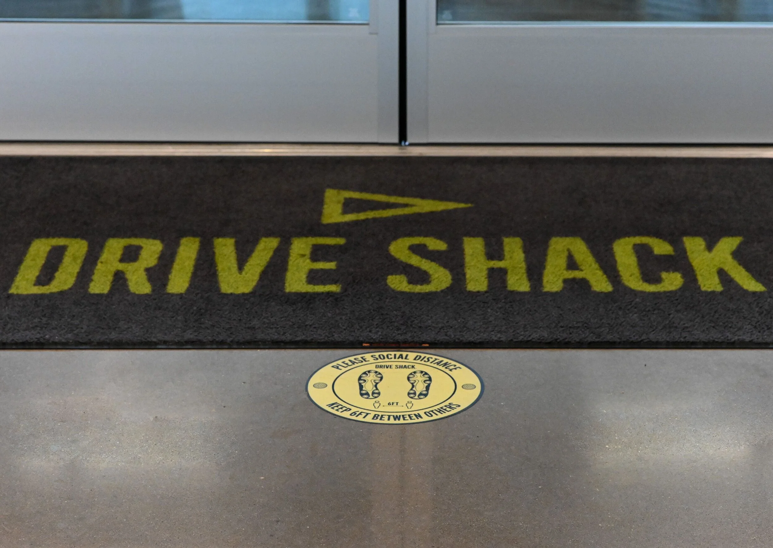
When creating this instructional floor decal I thought about the space in which it would exist. I wanted something simple and easy to follow. Since our floors are wide open space and or corridors I wanted it simple. I chose a circle design so guest could stand on top of them. Since our guests are golfers, I used golf cleats to show where each person should stand. Multiple floor decals are used to direct to floor of foot traffic. A experienced designer thinks of the space in which the sign is exhibited. I wanted something that didnt require anything extra. Just a simple floor decal to. This floor decal is printed in all of our venues. I challenge other designers to think of the space in which their design inhabit and how a sign can be much more useful.

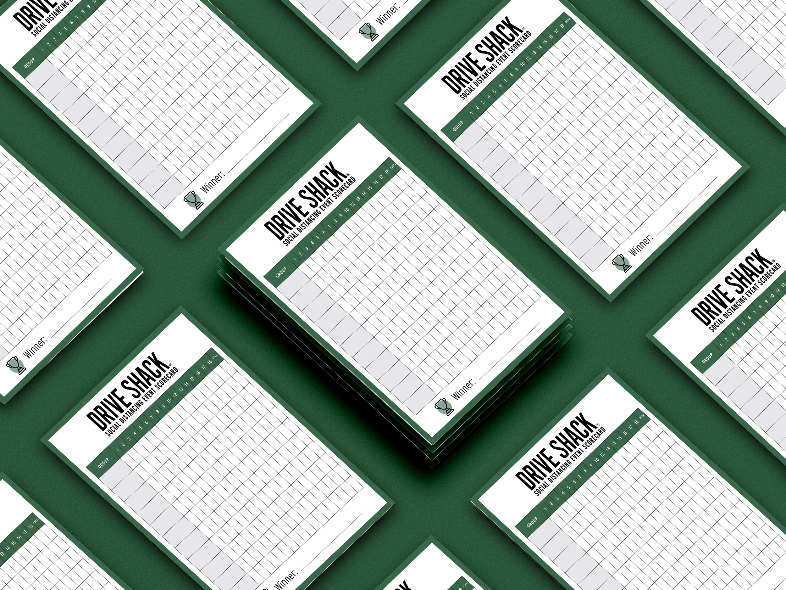
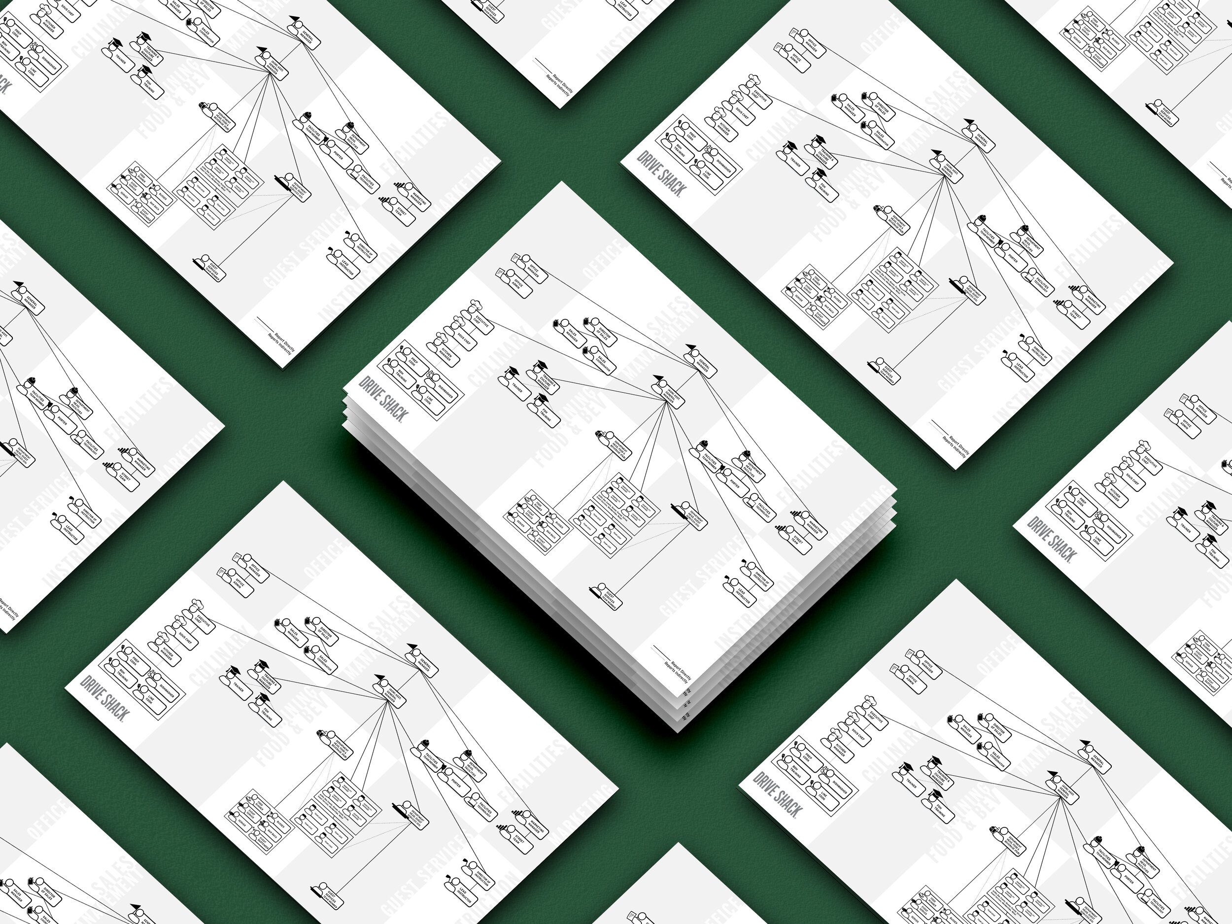
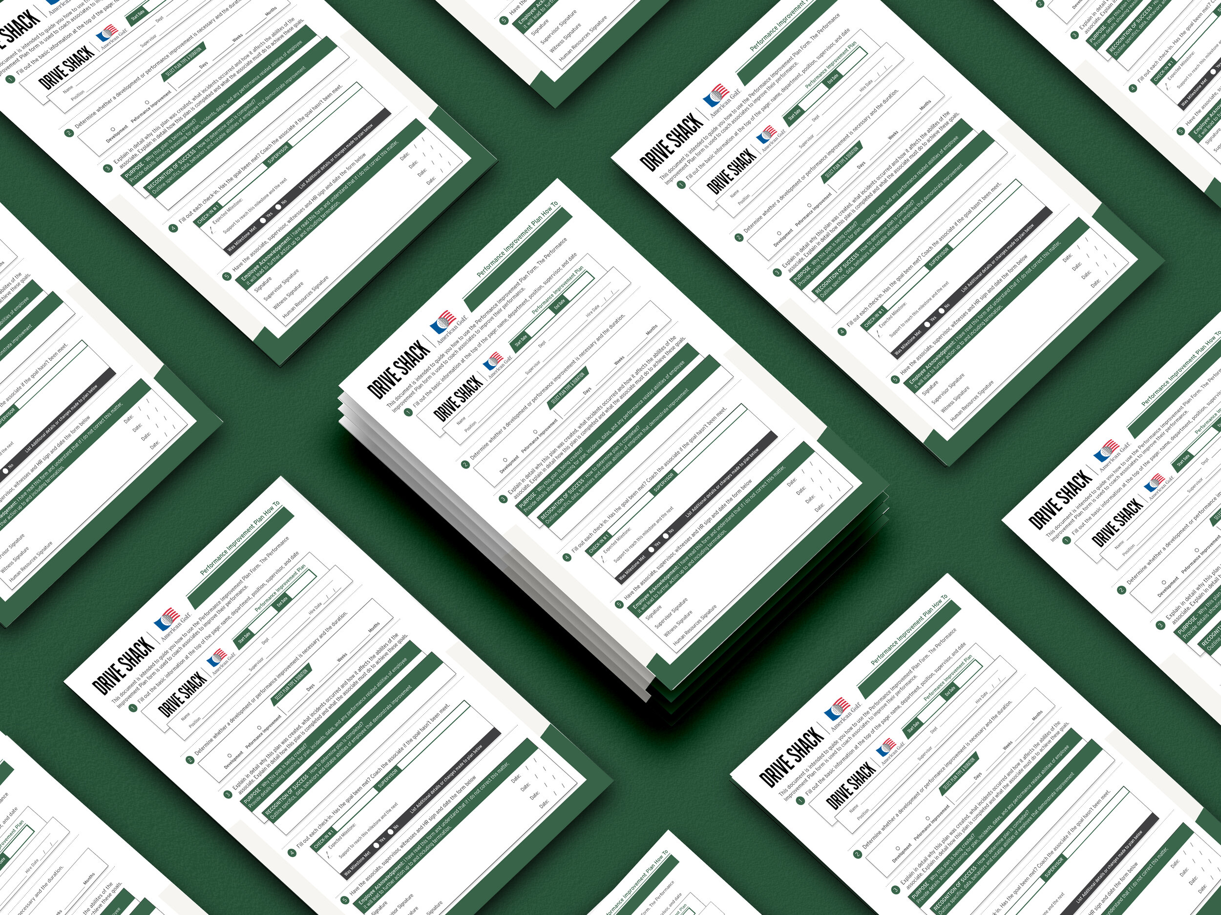
DISCIPLINE: Instructional Training Design
CLIENT: Drive Shack
DESIGN GOALS:
Create an eye catching company reporting diagram, guest score card, and performance improvement plan guide.
Create a tutorial to fit in the associates pocket.
Make the tutorial clean, easy to read and modern.
SOLUTIONS:
When creating this instructional tutorial I thought about the user. I wanted to create the company diagram with customized various position. The accessories of each employee signify their position and the role they do in each venue. I wanted to diagram to be easy to read so each employee know who they report to. I also divided each section into their own department. The simple grey color scheme means anyone in the office can easily print out and use the guide for reference. The department sections also act as fold lines so they can easily fit in an associates pocket.