NORTH HERO BREWING CO.
DISCIPLINE: Package Design
CLIENT: North Hero Brewing Co.
DESIGN GOALS:
Create eye catching packing for North Hero Brewing Co.
Create a package that attracts new and existing customers that entices them to try our products.
Make the packaging clean, easy to read and modern.
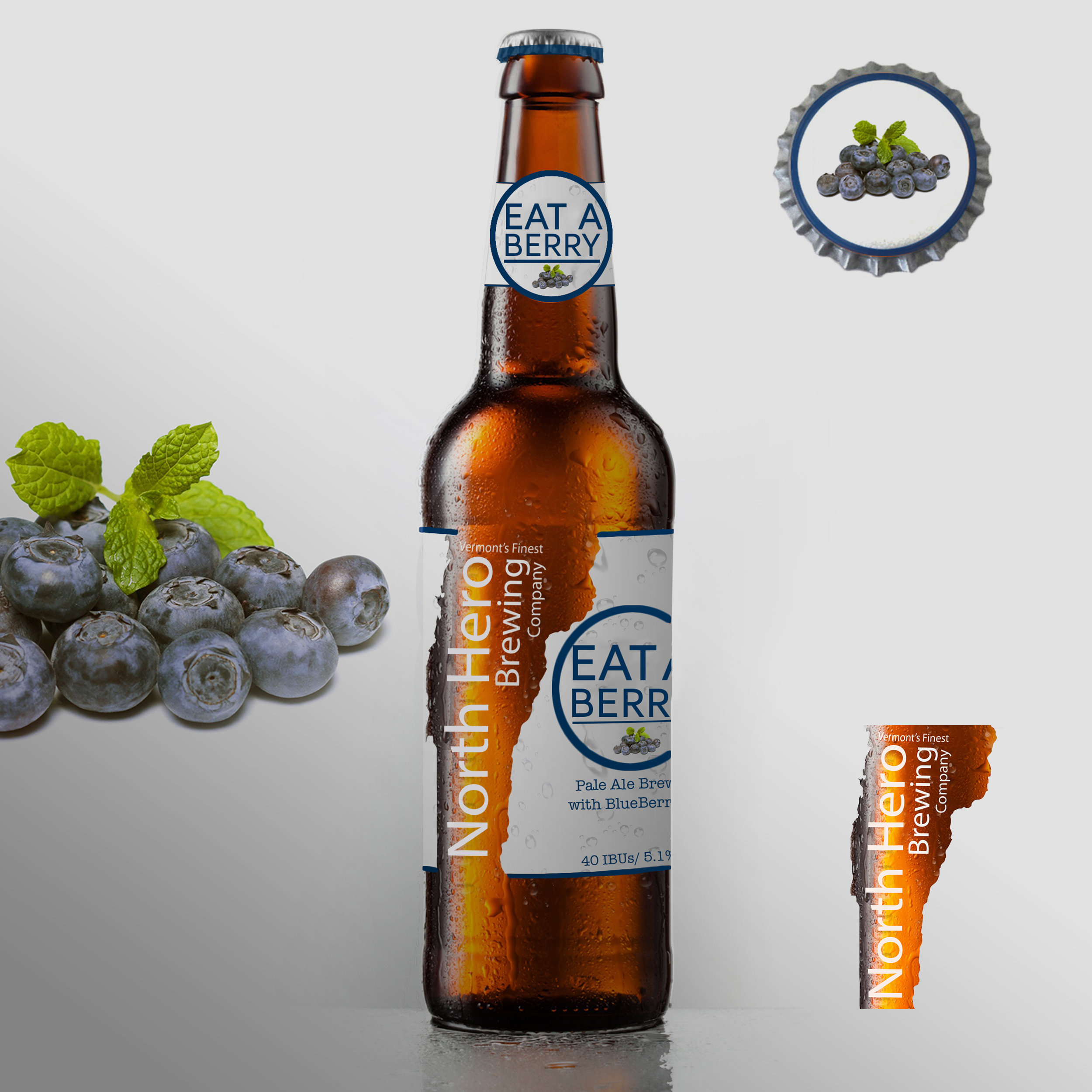
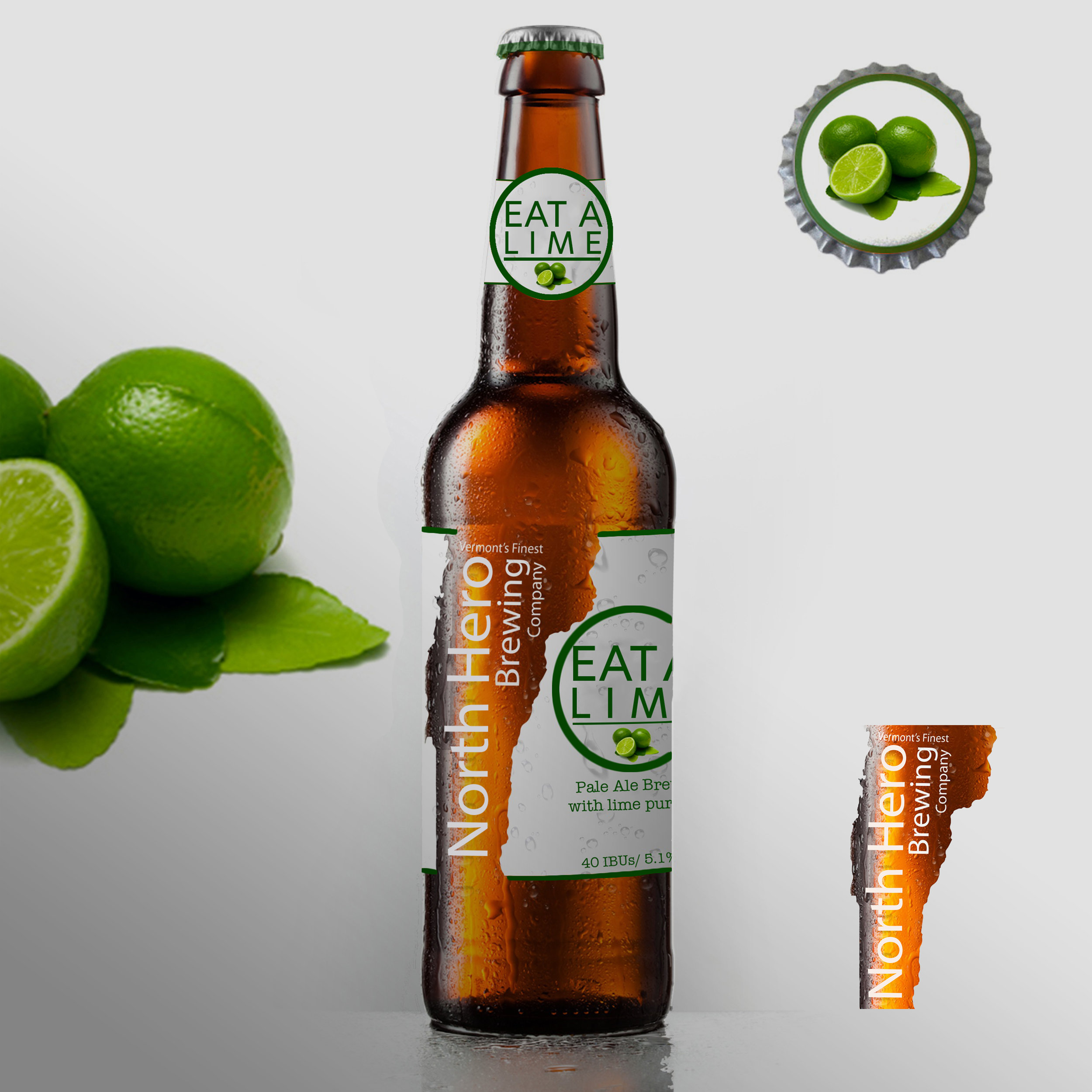
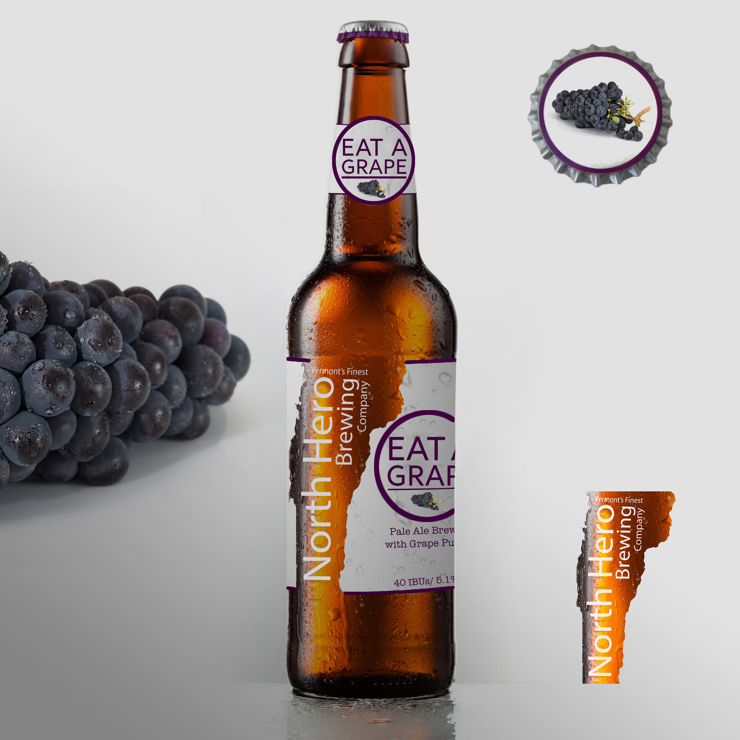
SOLUTIONS:
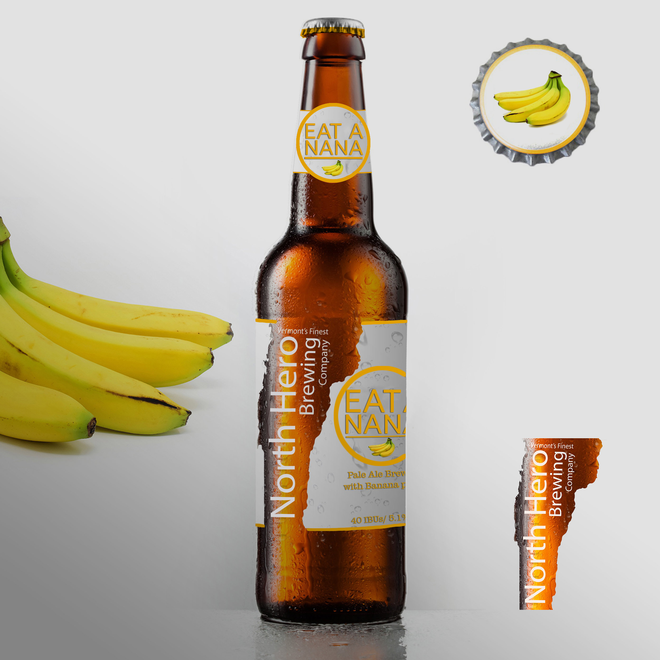
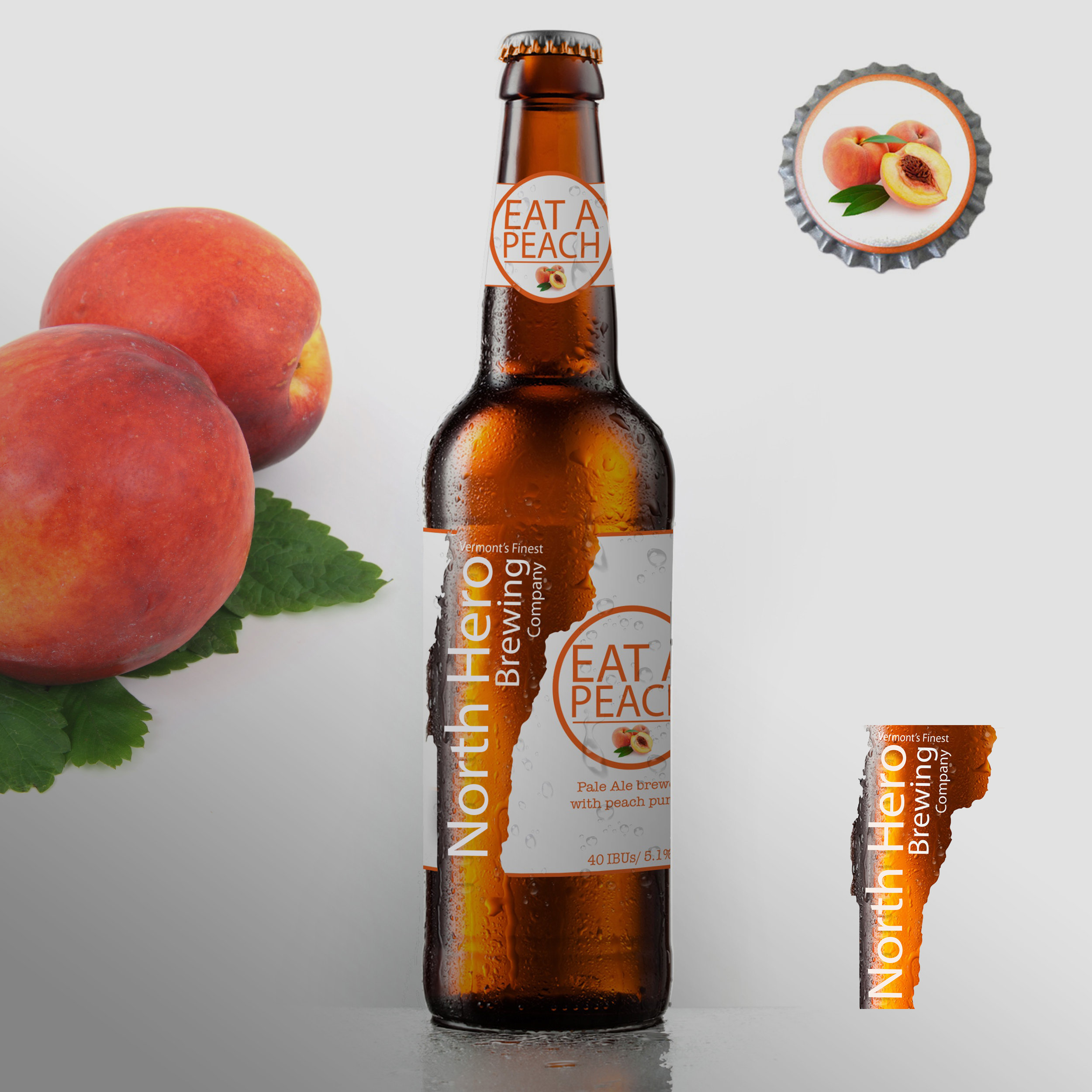
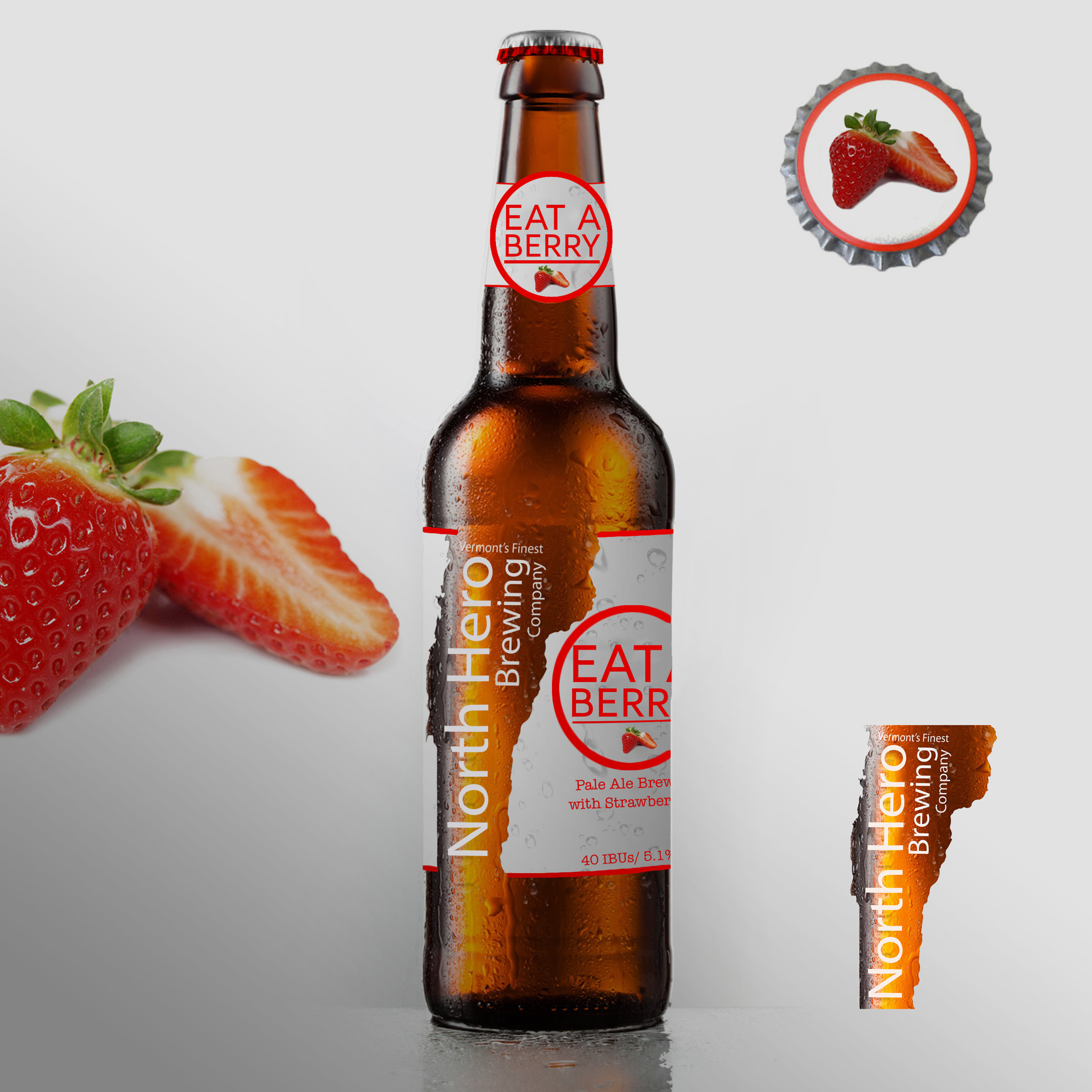
This is the package design mock up I created for North Hero Brewing Companies "Eat a Fruit" Flavors. I️ an extremely happy to see this package on the supermarkets shelves. It far exceeded my client's expectations. The great use of the Vermont fruit themed images with a monochromatic fruity color scheme helps this package excel on the supermarket shelves. The negative space image symbolize The Green Mountain State of Vermont. The fruit's negative space and color helps the product distinguish itself among the competition of beers in the cooler section. Each flavor features and embellishes each fruit, giving each bottle a irresistible flavor. Simplicity is key with this design. The simple san-serif fonts complements the Iconic American Typewriter. Crisp bold images of fruit contrast the brown ale. This package design won SUNY Albany's Graphic Design Exhibitions "Best of Show" and proudly sits in my portfolio and on store shelves.

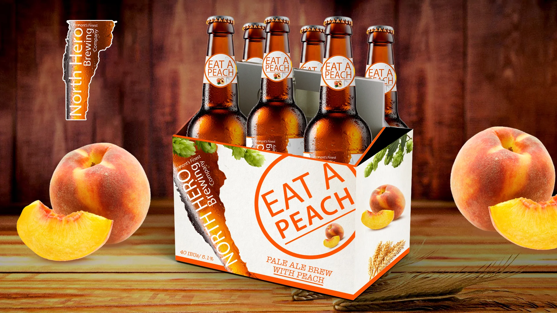
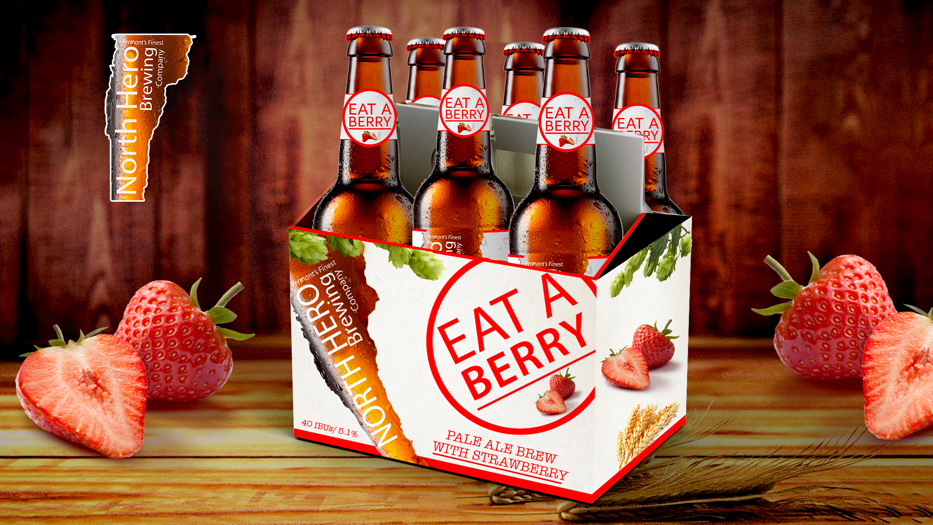
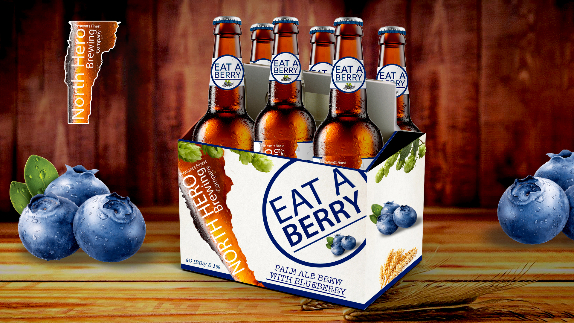
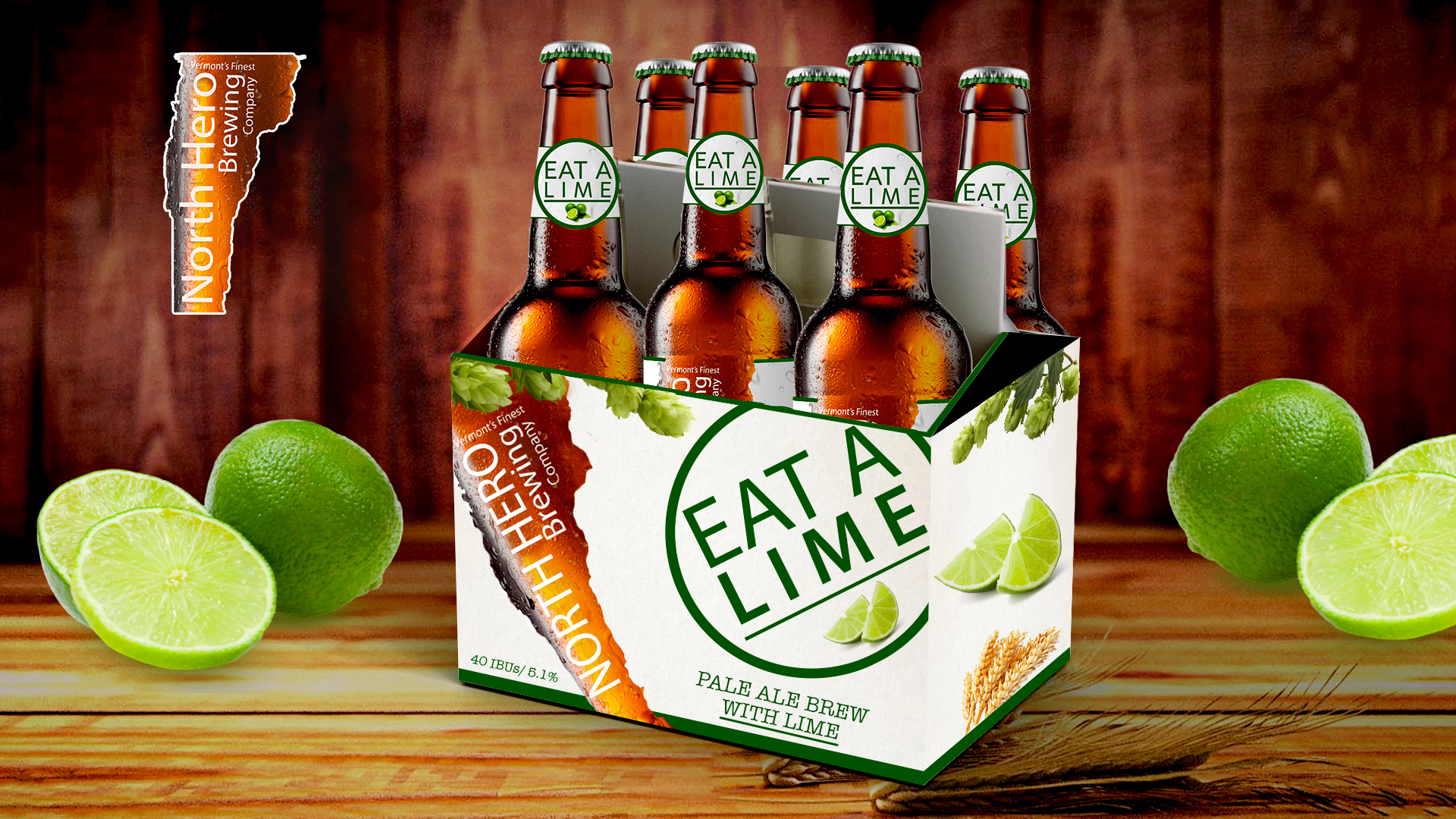
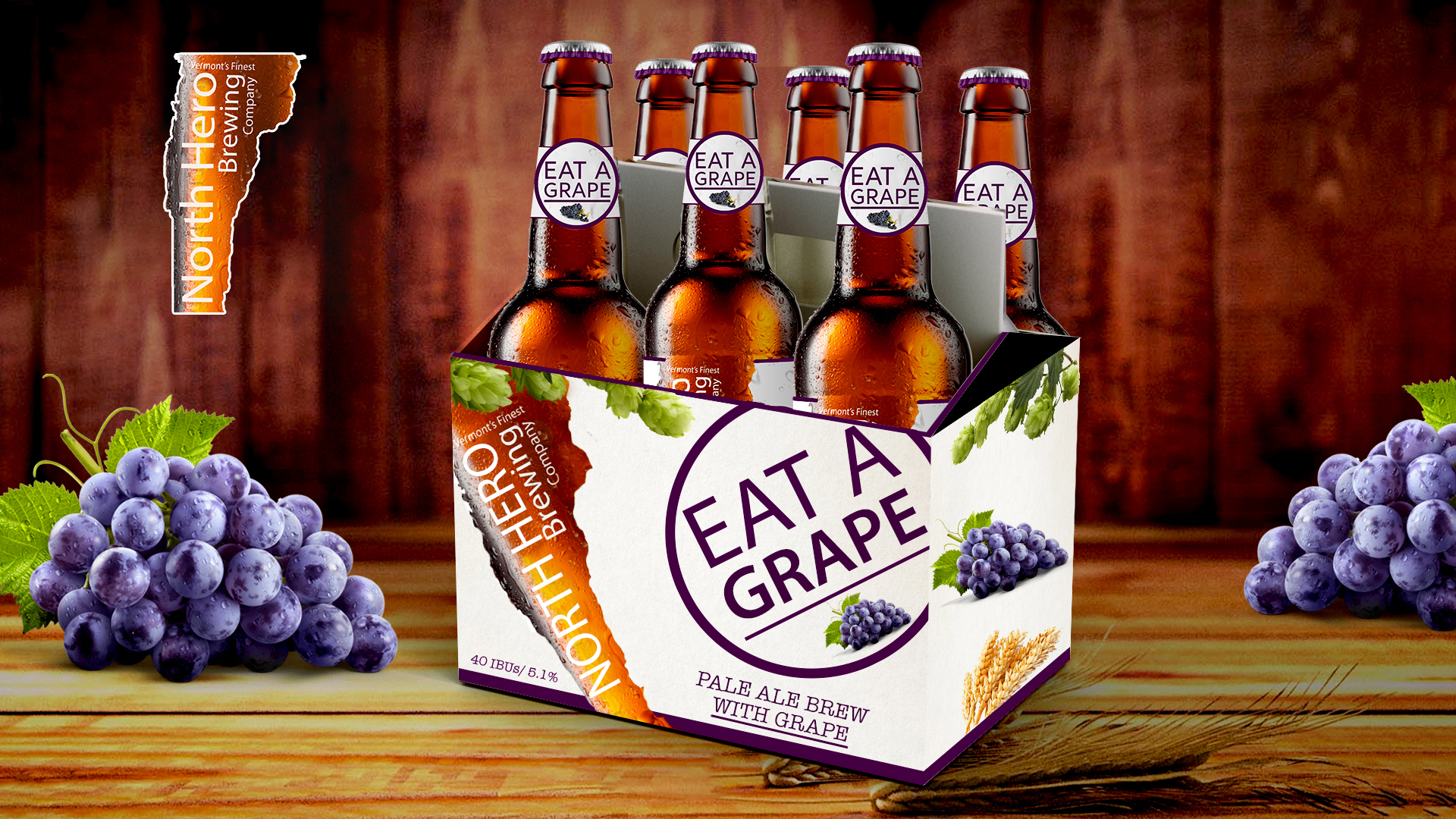
DISCIPLINE: Package Design
CLIENT: North Hero Brewing Co.
DESIGN GOALS:
Create eye catching packing for North Hero Brewing Co Eat A Fruit 6 Packs.
Create a package that attracts new and existing customers that entices them to try our products.
Make the packaging clean, easy to read and modern.
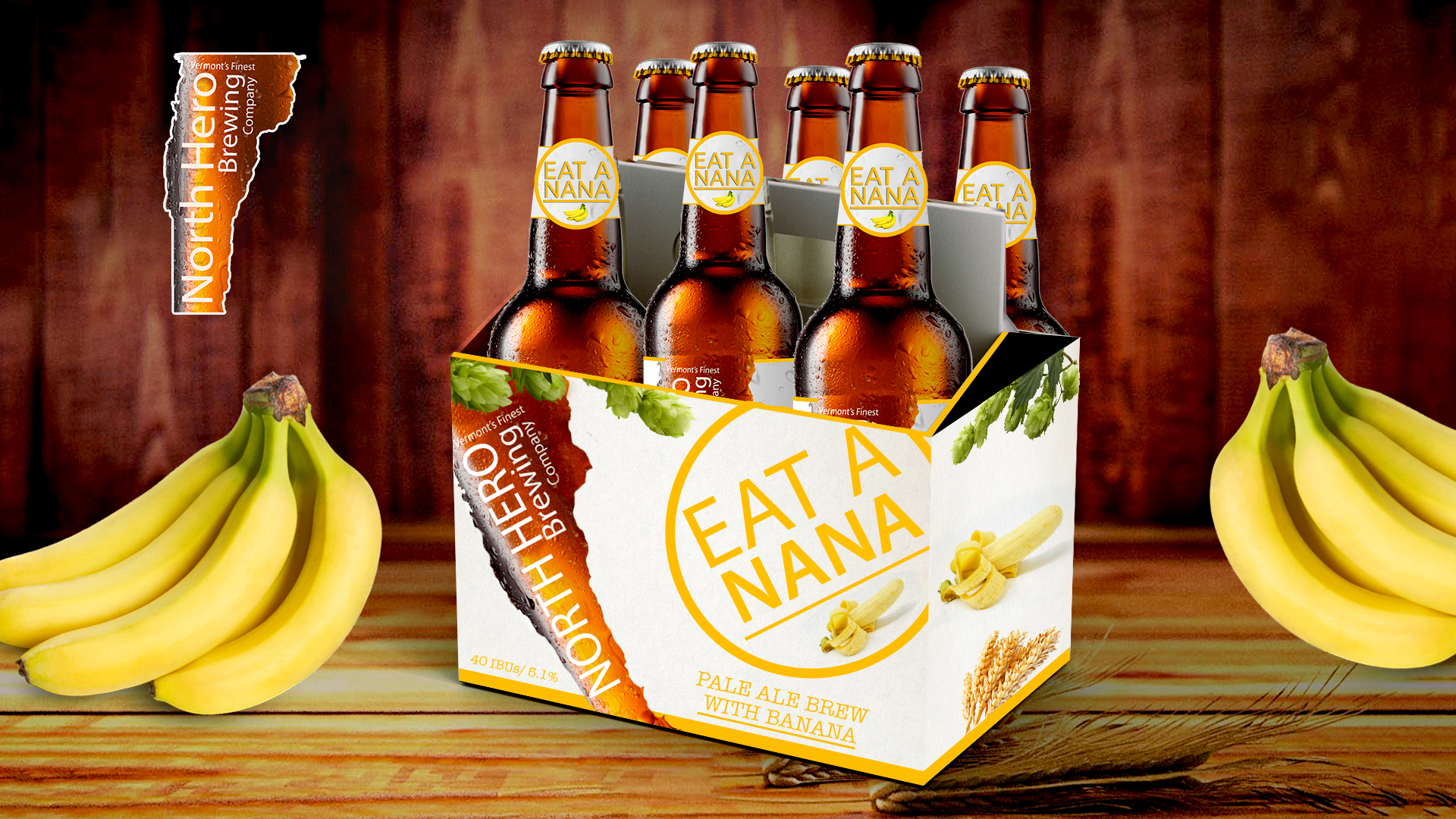
SOLUTIONS:
This is the package design I created for each of the six flavors of North Hero Brewing Company's six packs. The great use of the Vermont fruit themed images with a monochromatic fruity color scheme helps this package excel on the supermarket shelves. The six packs are modeled after each of the bottle designs. Each six pack inherited the bottles simplicity. The bold "Eat A Fruit" is eye catching and craft-fully angled for maximum interest. The bottle's negative space embodies the Green Mountain State. The fruit's negative space and color helps the product distinguish itself among the competition of beers in the cooler section. Large simple Images of fruit, wheat and hops encompass the design, immediately showing the viewer our rich bold flavors. Each six pack is beautiful mocked up on a rustic wooden shelf ready for display on any Vermont Barn.
*North Hero Brewing Company is not a real company. This case study was a self-inspired project on art direction and brand identity development.