URBAN UPBOUND

DISCIPLINE: Print Design
CLIENT: Urban Upbound
DESIGN GOALS:
Create a series of fliers for Urban Upbound to promote the OSHA 30, and Incentive Programs.
Create the flyers so it is easy to read and effective at displaying the information.
Make the flyers entice the viewers to want to be a part of changing their lives and tackling poverty.
SOLUTIONS:
These are the flyers I created for Urban Upbound's job incentive events and OSHA 30 Class. The OSHA 30 is a class that gives individuals certifications for construction fields. Each invitation features a different branding to appeal to different audiences. The yellow fonts make the OSHA flyer have the construction theme and makes people want to be involved in that job sector. I chose a bold font to represent that foundations people will have the in construction fields. The nice subtle touch of the bolts as bullets helps convey the theme and branding of the flyer. The images were chosen to fit the respective demographics of each class and helps connect with individuals on a personal level. If your organization needs flyers to promote people's lives Thung Designs is your answer! We have years of experience in promoting non-profits organizations.


DISCIPLINE: Print Design
CLIENT: Urban Upbound
DESIGN GOALS:
Create a flyer to encourage clients to get involved with the Urban Upbound Bridge to Pursuit Program.
Create advertisements to showcase the promotion of the program in a fun and exciting way.
Make the posters encouraging and convey the information in a simple format.
SOLUTIONS:
These are the posters I created for the Urban Upbound Bridge to Pursuit Program. Pursuit is a tech training program, that helps students learn coding to to get high paying tech sector jobs, like web and computer development, SEO, computer programmers, etc. Our program helps our clients increase their chances of getting accepted into the Pursuit program by teaching them prerequisite skills. The program has the potential to transform peoples lives and that is what I wanted to showcase in this flyer. I started off by looking at Pursuits brand Identity and then mixing it with and Urban Upbound Flair. The bright yellow and rich black font details that flyer is about the Pursuit program. I mixed Typography from both Pursuit and Urban Upbound’s brand guidelines. The yellow grey-scale image mixed with Urban Upbound’s target demographics is a perfect amalgamation of Pursuit and Urban Upbound’s Design. It was a pleasure to design this flyer and help students transform their lives with new career opportunities.


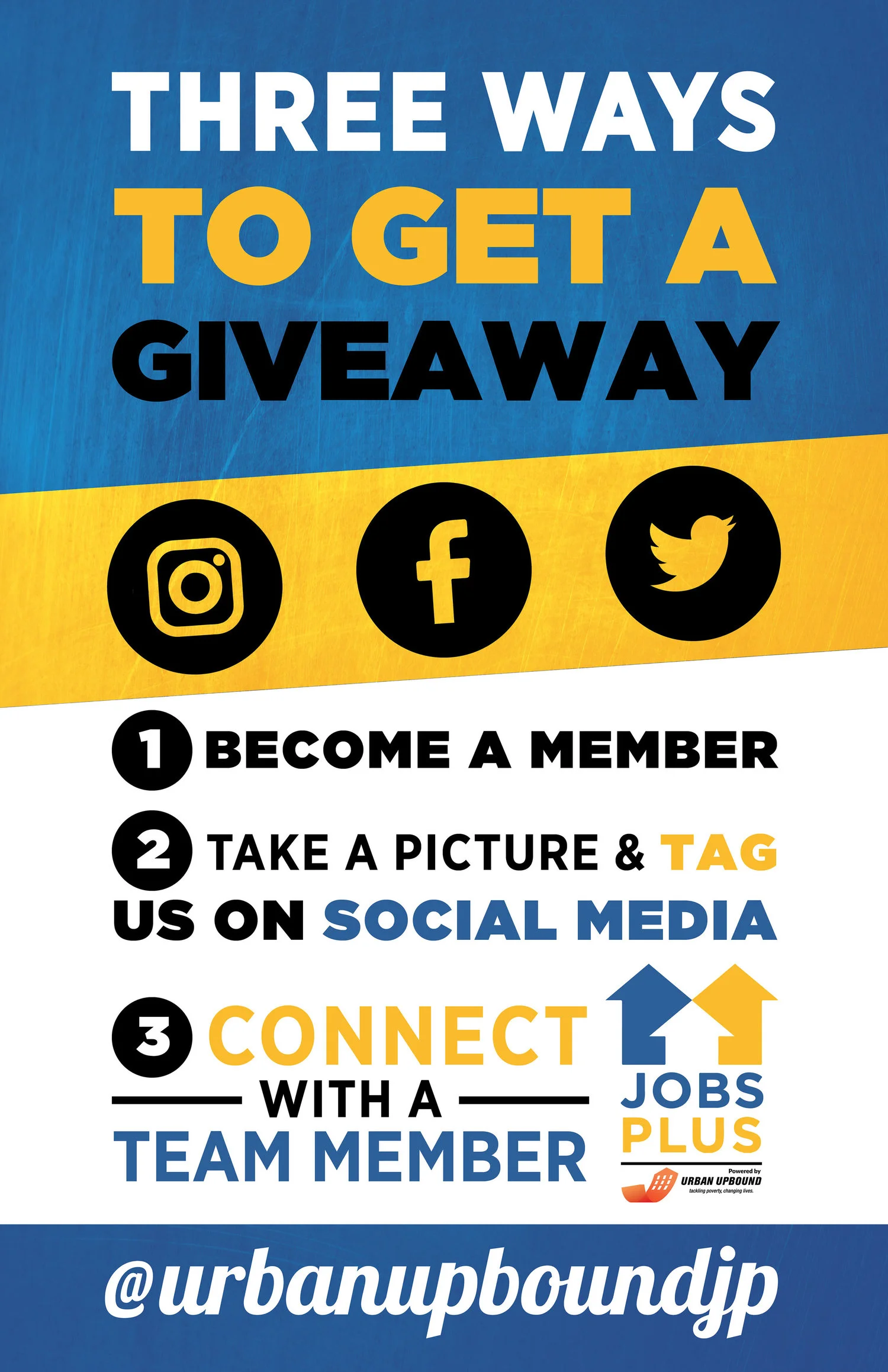
DISCIPLINE: Print Design
CLIENT: Jobs Plus
DESIGN GOALS:
Create social media signs to encourage clients to get involved with their jobs online.
Create advertisements to showcase the promotion of the giveaway in a fun and exciting way.
Make the posters encouraging and convey the information in a simple format.
SOLUTIONS:
These are the posters I created for Jobs Plus. Jobs Plus is a organization that matches clients with available jobs in the community. Our mission was to create and promote Jobs Plus's social media presence. Jobs Plus is well known in low income communities across the five boroughs of New York City; now Jobs Plus can communicate with their clients online twenty-four hours a day. The posters follow Job Plus's color scheme of blue and yellow with inviting hands from their councilors. Simple social media icons draw the viewers attention as they pass by their locations. Simple wording helps get the message across to clients with just the slightest glance. It was a pleasure to create these posters and have them benefit communities across New York City.

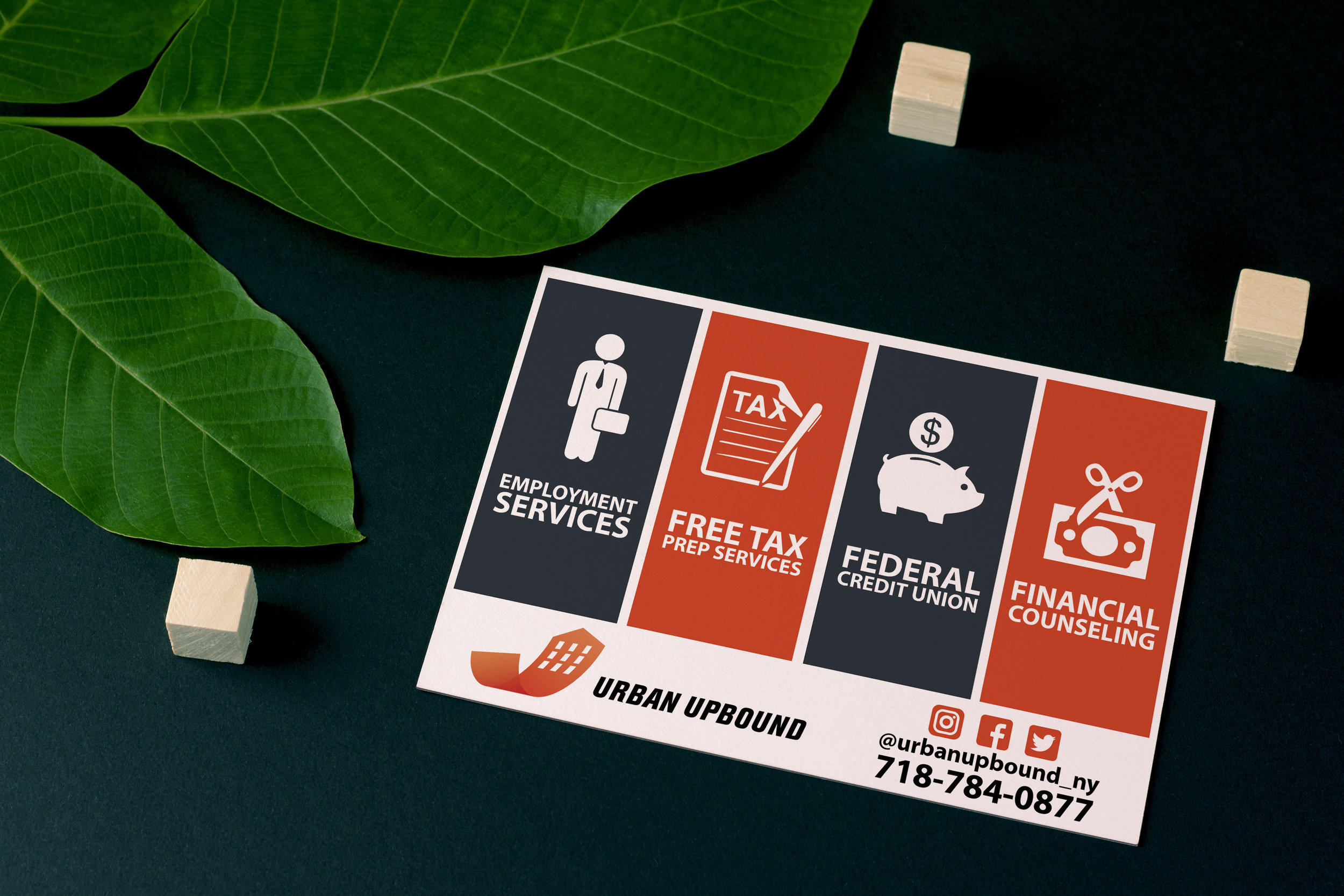
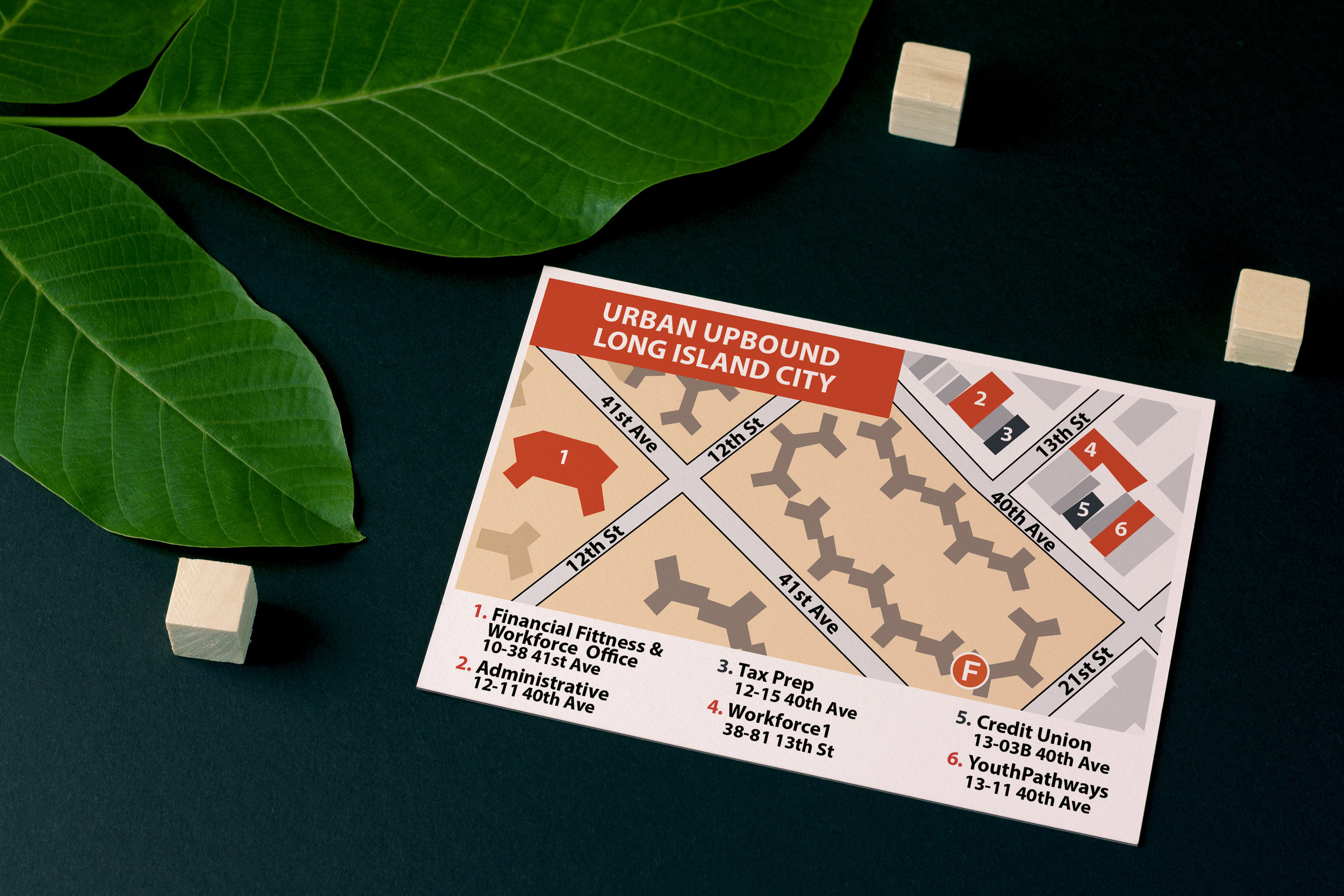
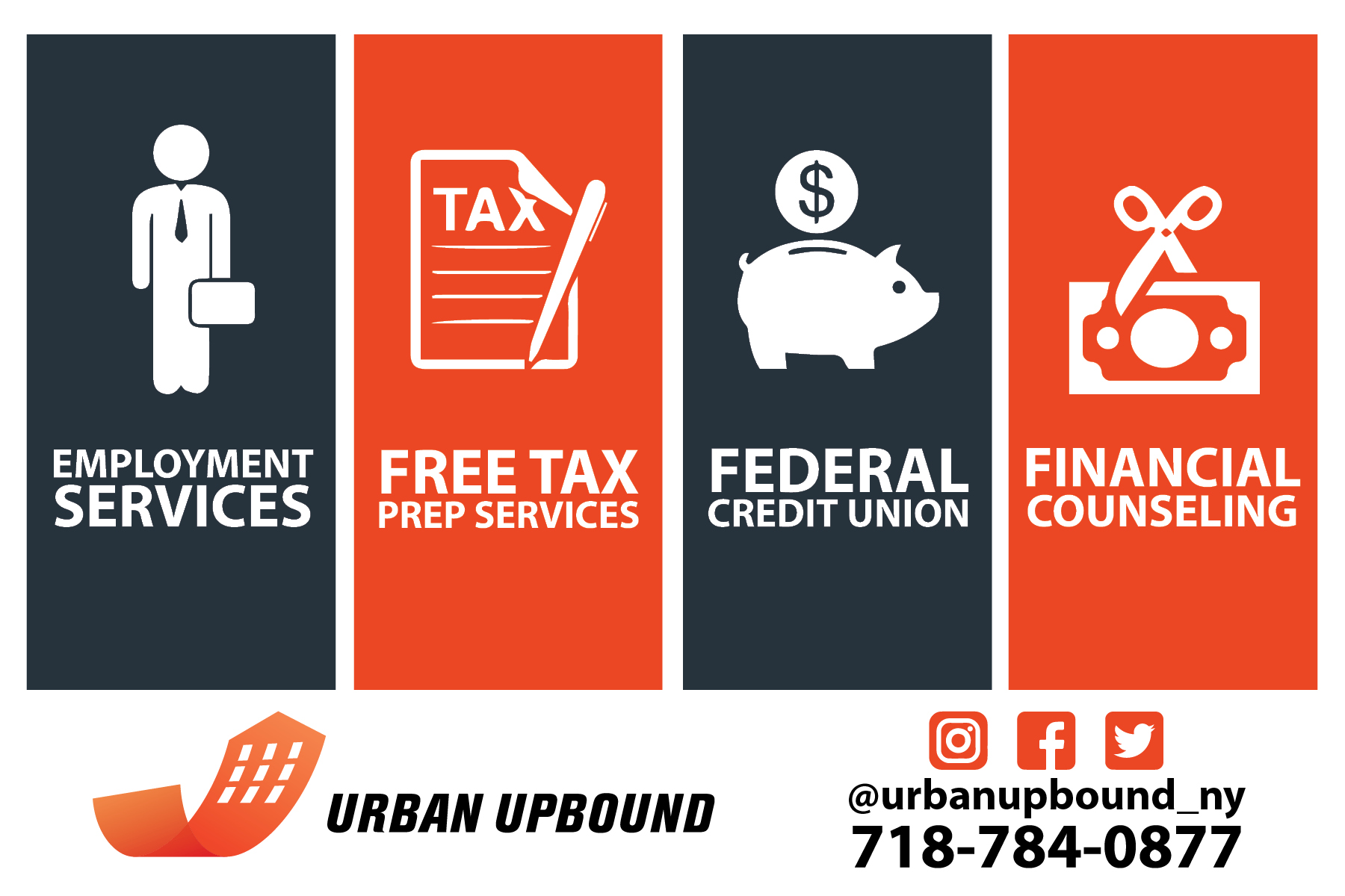
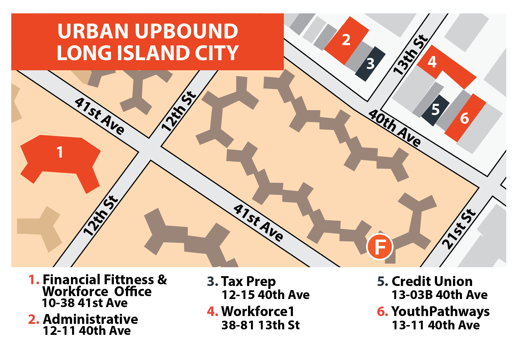
DISCIPLINE: Print Design
CLIENT: Urban Upbound
DESIGN GOALS:
Create rave cards for each of Urban Upbound's locations. (Far Rockway, Astoria, Long Island City, East Harlem, Bronx)
Create a easy to read and effective rave card to be handed out while canvasing.
Make the cards display a summary of Urban Upbound's job enrichment services.
SOLUTIONS:
These are the awesome rave cards I created for Urban Upbound's various locations. Each card is for a different location and the pictures appeal to each sites clientele. The cards are designed to be quick and easy to hand out while canvasing the communities. I chose images with white backgrounds to give the black and orange text maximum contrast. Happily posed individuals embody Urban Upbound's mission statement and organizations culture. Simple and bold text makes the cards easy to read and convey the information as smooth as possible. These cards with high quality printing imbue Urban Upbound's professionalism.

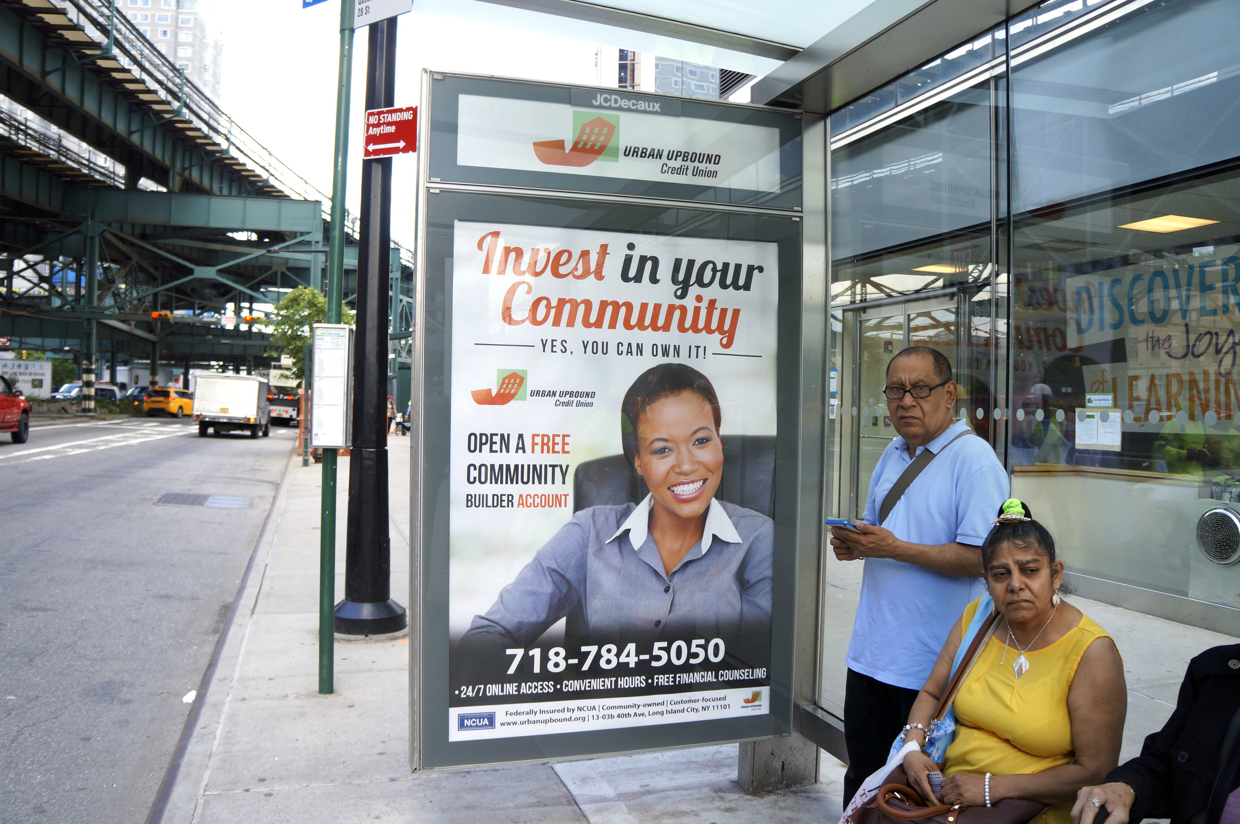
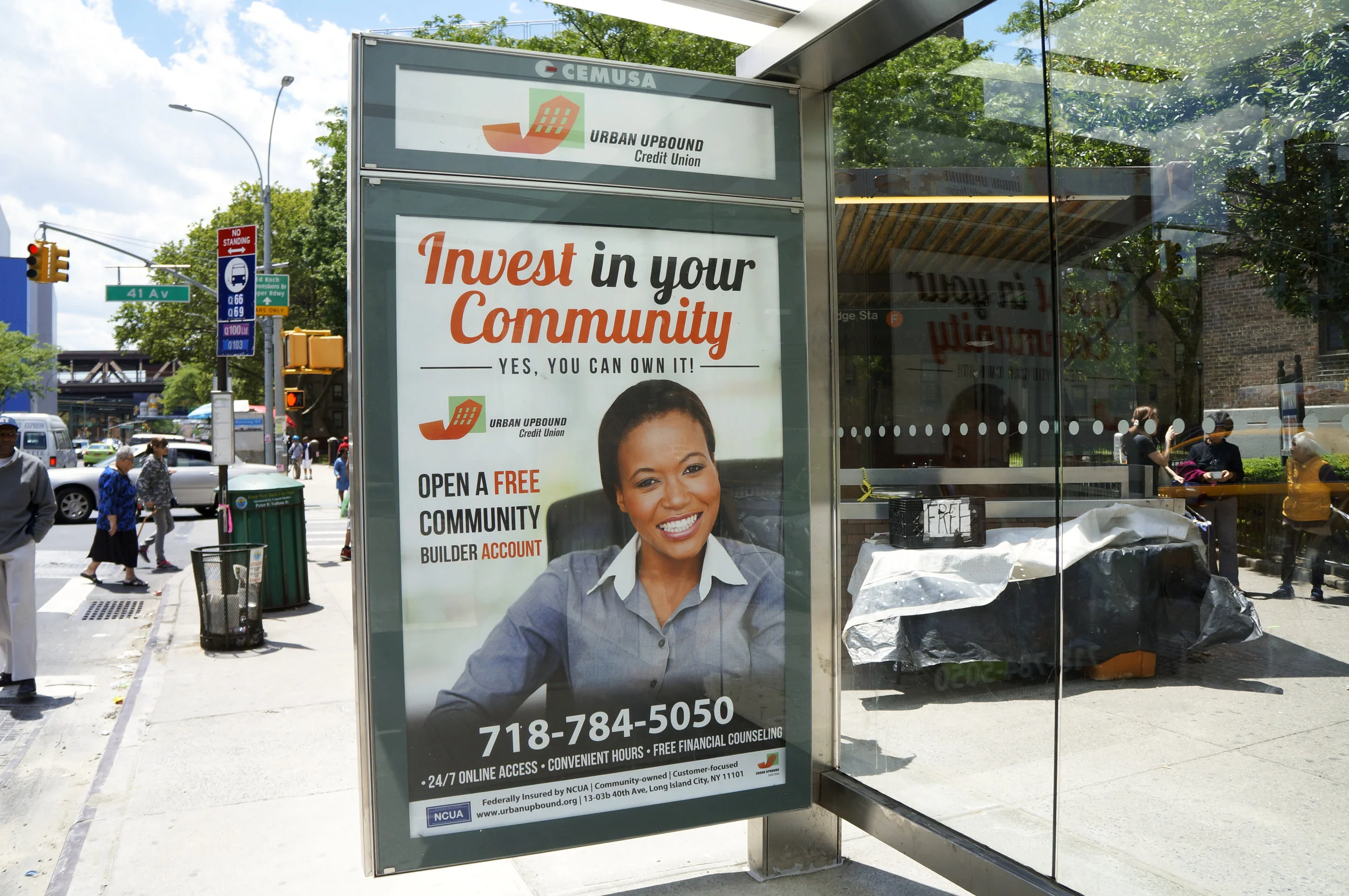
DISCIPLINE: Print / Installation Design
CLIENT: Urban Upbound Federal Credit Union
DESIGN GOALS:
Create a New York City MTA bus stop advertisement.
Create the advertisement to engage the community to sign up for services at the Urban Upbound Credit Union.
Make the stop an inviting installation just like the Urban Upbound Credit Union.
SOLUTIONS:
This is the MTA Bus stop advertisement I created for The Urban Upbound Federal Credit Union. The stop were in Queensbridge and Queensbough plaza in Long Island City, NYC and were on display for May 2017. There are hundreds of bus stops across the five Boroughs in New York City. It was an honor to be able to create such a large scale project and is a milestone for my portfolio. Thousands of residents, tourists and locals pass by these signs each day. I have always taken a keen eye to package design and this is the ultimate package; standing at over six and a half feet the work embodies the entire vicinity as an installation. The teller resembles Urban Upbound's diverse staff and clientele. It actively engages with the clients, they feel as though they can relate to the teller on a personal level. Bold Fonts stress the emergence to invest in our communities. The Orange color scheme grabs attention as it complements the blue New York City Skylines. By standers are able to understand the message with just a glance of their busy lives. I can't wait to design more advertisements in conjunction with the MTA in the near future!


DISCIPLINE: Print Design
CLIENT: Urban Upbound Federal Credit Union
DESIGN GOALS:
Create a flyer to advertise the Urban Upbound's Credit Union.
Create a new brand identity for the Credit union color scheme, theme, and design.
Make the flyer clean, easy to use and print friendly.
SOLUTIONS:
The Urban Upbound Federal Credit Union is a credit union designed to promote economic prosperity for the community. Centered around a savings account, CDs, and paying NYCHA rent, the Urban Upbound Credit Union is designed to allow community members to keep their hard earned money and invest in the community. These flyers are centered around showing the community the services in their area. With shared certificate clients can save money for business endeavors, holidays, vacation or their next big purchase. The orange color scheme unites the credit union along with the other services Urban Upbound provides with a strong brand identity. The money and bank represent the client's hardworking and savings potential. A clean layout with sectioned boxes displays the information simply and effectively. It was a pleasure to help promote the mission of the federal credit union and their members. And it fits the art direction of our MTA Bus Stop Advertisement.


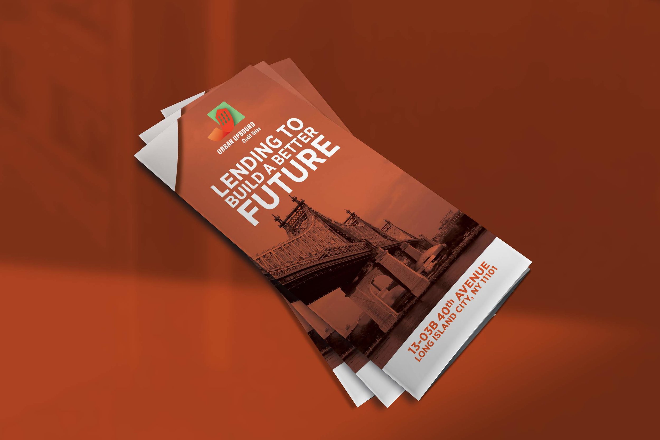
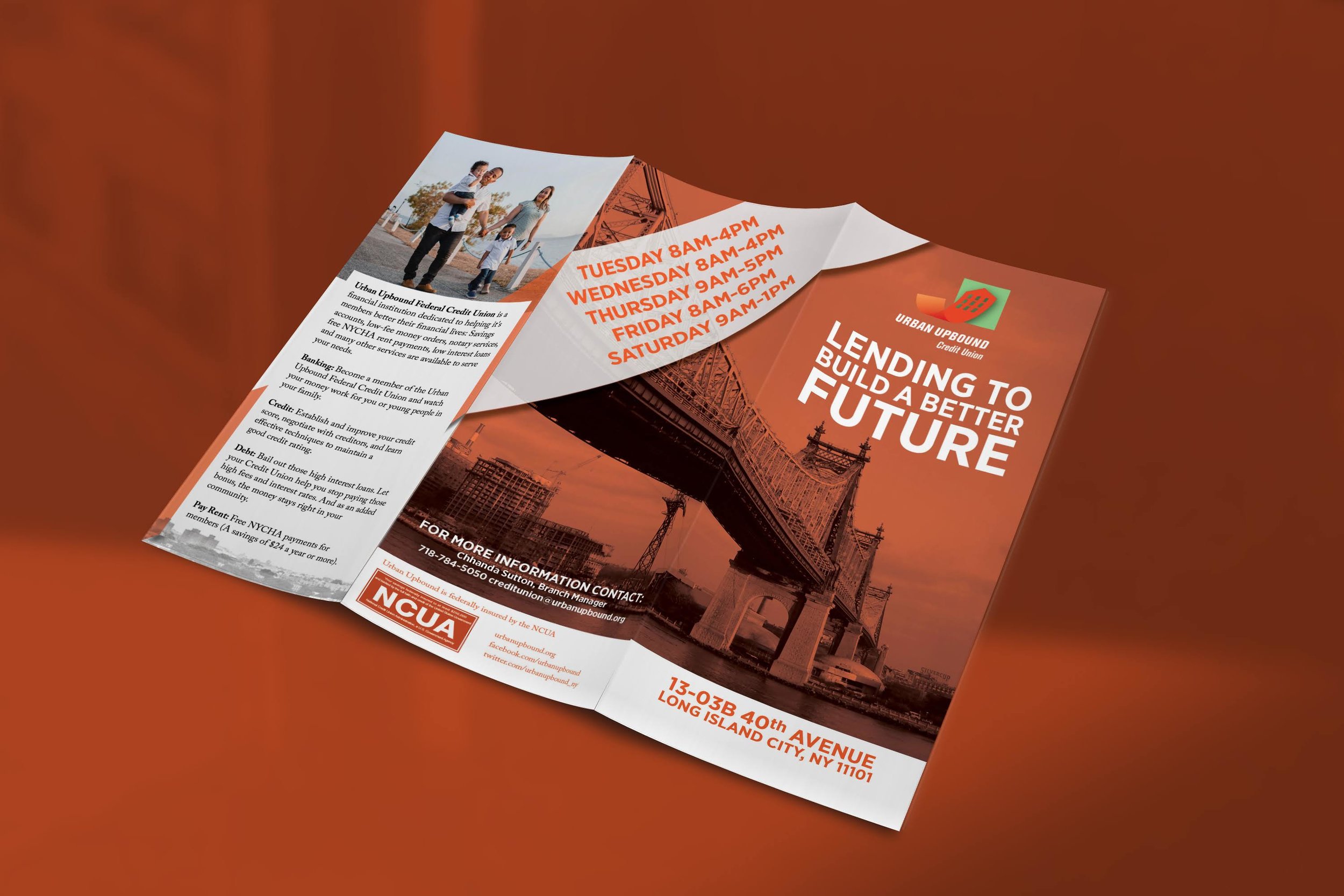
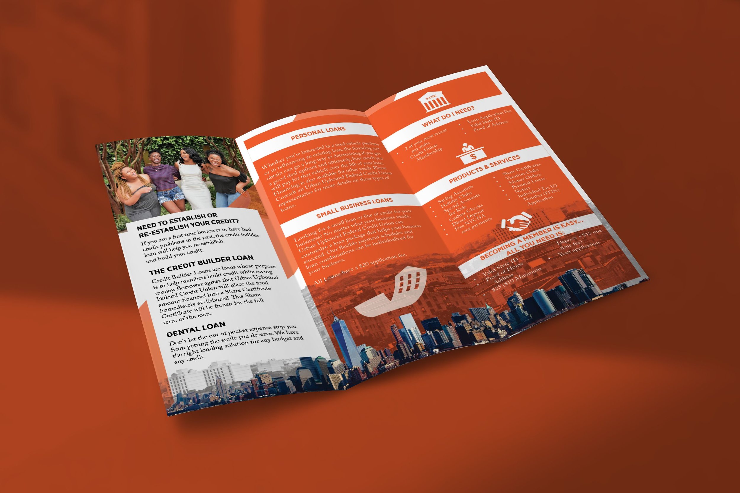
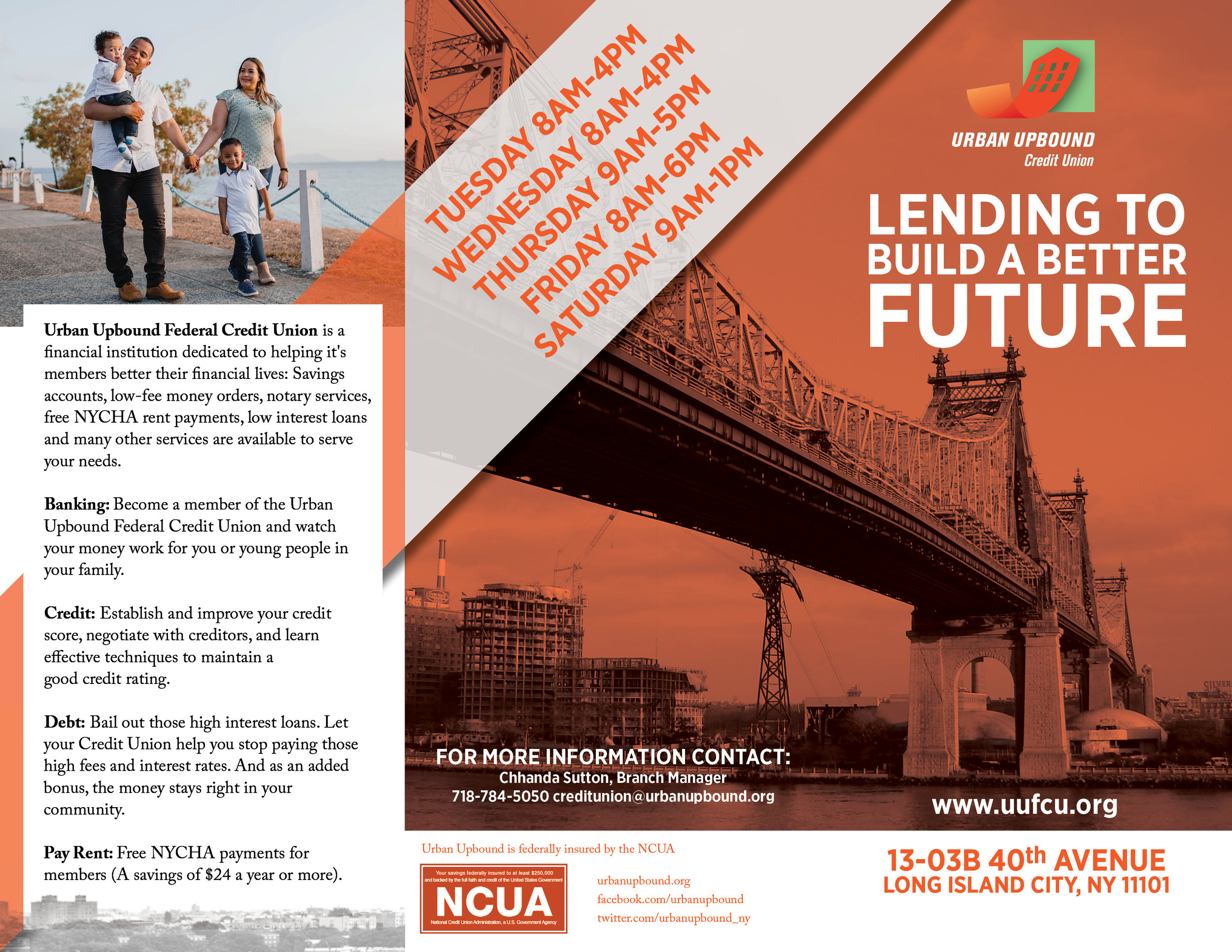
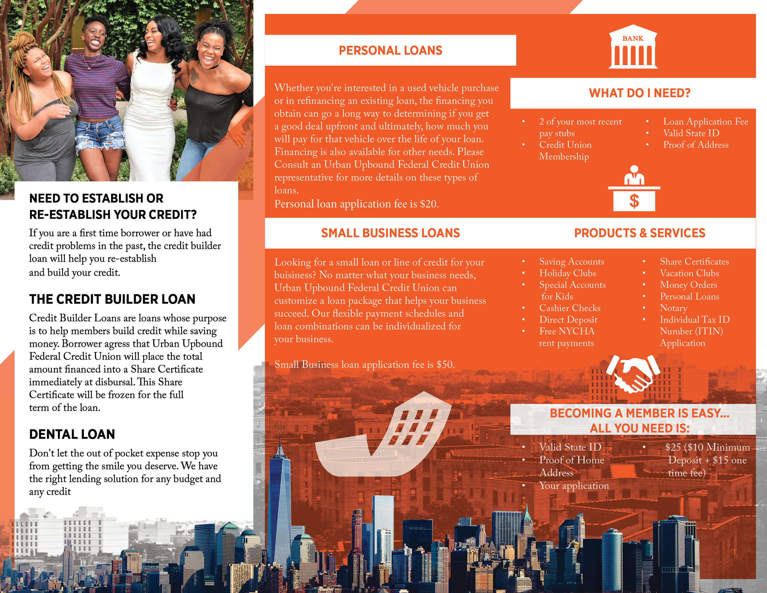
DISCIPLINE: Print Design
CLIENT: Urban Upbound Federal Credit Union
DESIGN GOALS:
Create a Brochure to advertise the Urban Upbound's Credit Union’s services.
Create a new brand identity for the Credit union color scheme, theme, and design.
Make the Brochure clean, easy to use and print friendly.
SOLUTIONS:
The Urban Upbound Federal Credit Union is a credit union designed to promote economic prosperity for the community. Centered around a savings account, CDs, and paying NYCHA rent, the Urban Upbound Credit Union is designed to allow community members to keep their hard earned money and invest in the community. These Brochures are centered around showing the community the services in their area. With shared certificate clients can save money for business endeavors, holidays, vacation or their next big purchase. The orange color scheme unites the credit union along with the other services Urban Upbound provides with a strong brand identity. The photography represent the client's as they see themselves in the photo. A clean layout with sectioned boxes displays the information simply and effectively. It was a pleasure to help promote the mission of the federal credit union and their members. And it fits the art direction of our MTA Bus Stop Advertisement.


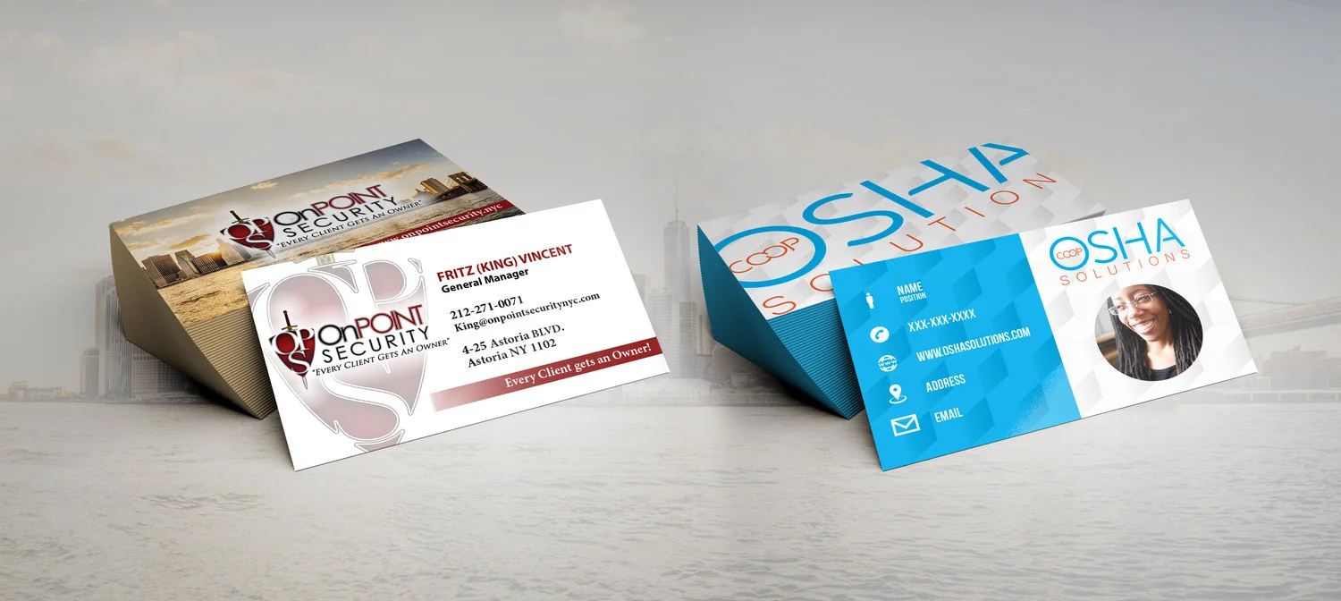
DISCIPLINE: Print Design
CLIENT: OSHA Solutions & OnPoint Security
DESIGN GOALS:
Create business cards for OSHA Solutions and OnPoint Security to use.
Create a brand identity incorporating the logo.
Make the business cards clean, easy to read, and memorable on all formats.
SOLUTIONS:
OnPoint Security and OSHA Solutions came to Thung Designs in need of business cards. Both are worker CO-OPs, a collection of workers who pool their knowledge, resources and ownership for the collective company. OnPoint Security came to me with a basic business card wanting us to revitalize their brand identity into something flourishing. The cards needed to be competitive in the tough security market. We started with enhancing their photo of the New York City skyline and giving it a sepia tone to contrast and develop the warm color scheme. We enhanced their logo to be the center of the design as the shield should be the center of any strong security company. OSHA Solutions had zero branding when they came to us. We started by developing a logo from their ideas. We embellished their colors to make them more vibrant and contrasting. The colors complement the employees vibrant personalities and is symbolized by a snapshot on each card. The blue hues create a cool and calm tone to the cards as potential clients can calm their worries as OSHA Solutions has the solutions. We look forward to developing other promotional materials and websites for the two worker CO-Ops!