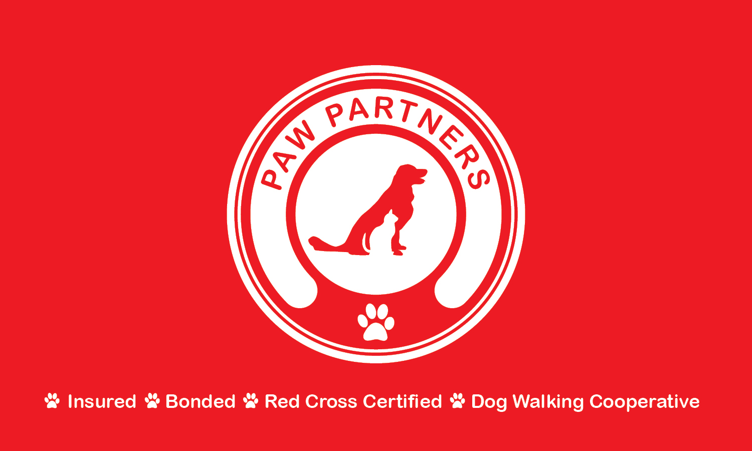
PAW PARTNERS

DISCIPLINE: Logo Design
CLIENT: Long Island City Paw Partners
DESIGN GOALS:
Create a logo for LIC Paw Partners to use on digital and print media.
Create a brand identity incorporating the logo.
Make the Logo clean, easy to read, and memorable on all formats.
SOLUTIONS:
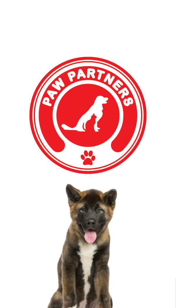
This is the Logo Mock Up I created for Long Island City Paw Partners. The logo features a dog and cat in the positive and negative space. This shows the company services various type of pets. The red color scheme catches your attention, and draws interest into the brand. A clean rounded font mimics the circular badge the logo is encased in. Across from the name features a paw to symbolize the Paw in Paw Partners. The logo maintains its simplicity throughout ranging from the font and circular badge. This helps the logo recognizable and iconic.


DISCIPLINE: Print / Logo Design
CLIENT: Long Island City Paw Partners
DESIGN GOALS:
Create business cards for Long Island City Paw Partners.
Create the business cards to convey the works contact information in a simple and effective way.
Make the business card enhance and develop each companies branding in a fun and exciting way.
SOLUTIONS:
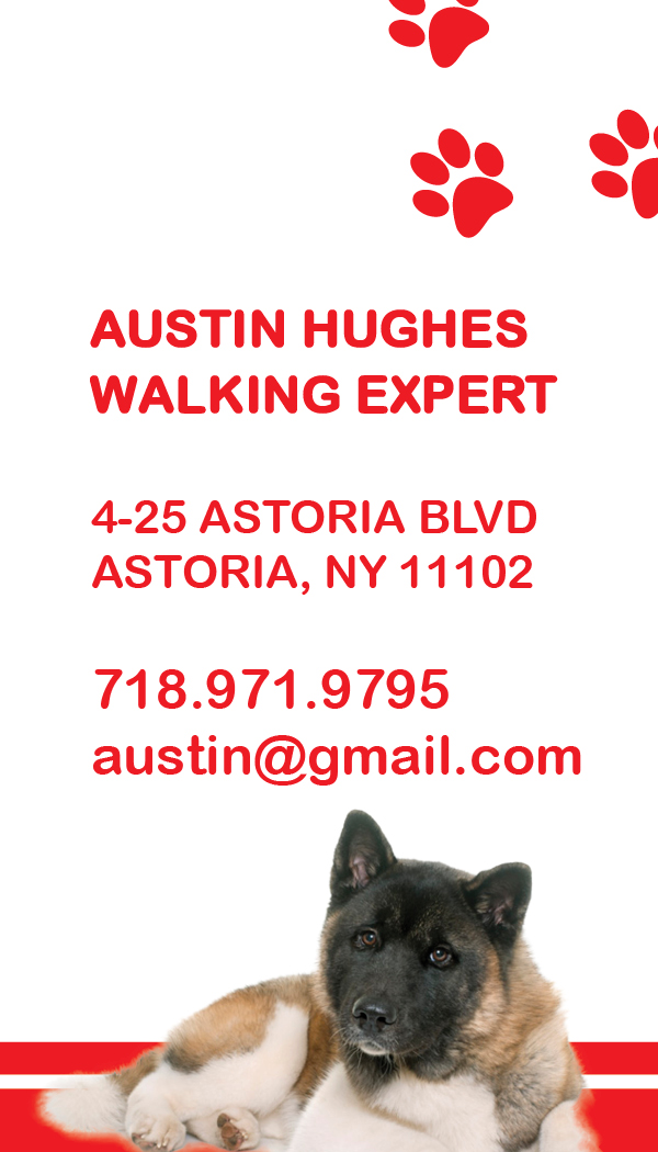
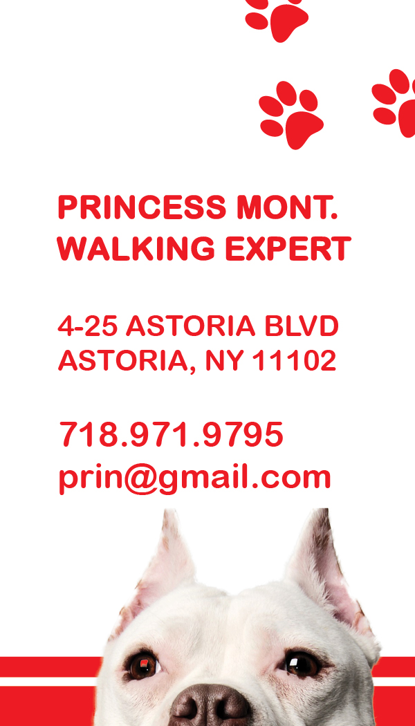
These are the business cards I came up with for Paw Partners. Paw Partners is a CO-OP; a collection of workers who pool their knowledge, resources and ownership for the collective company. Paw Partners contracted me to develop their brand identity from the beginning. We started with enhancing their logo with complementing the logo with the paw prints. We decided to make the business cards unique by making them vertical. This perfectly frames the dog's portrait. The use of cute dog images draw a connection between the client, paw partners and their furry friends. We designed the cards to be clean and simple and effective. We look forward to developing other promotional materials and websites for the worker CO-OPs!

DISCIPLINE: Print Design
CLIENT: Long Island City Paw Partners
DESIGN GOALS:
Create a greeting cards for Long Island City Paw Partners.
Create the greeting cards to convey the works contact information in a simple and effective way.
Make the greeting card enhance and develop the brand identity in a fun and exciting way.
SOLUTIONS:
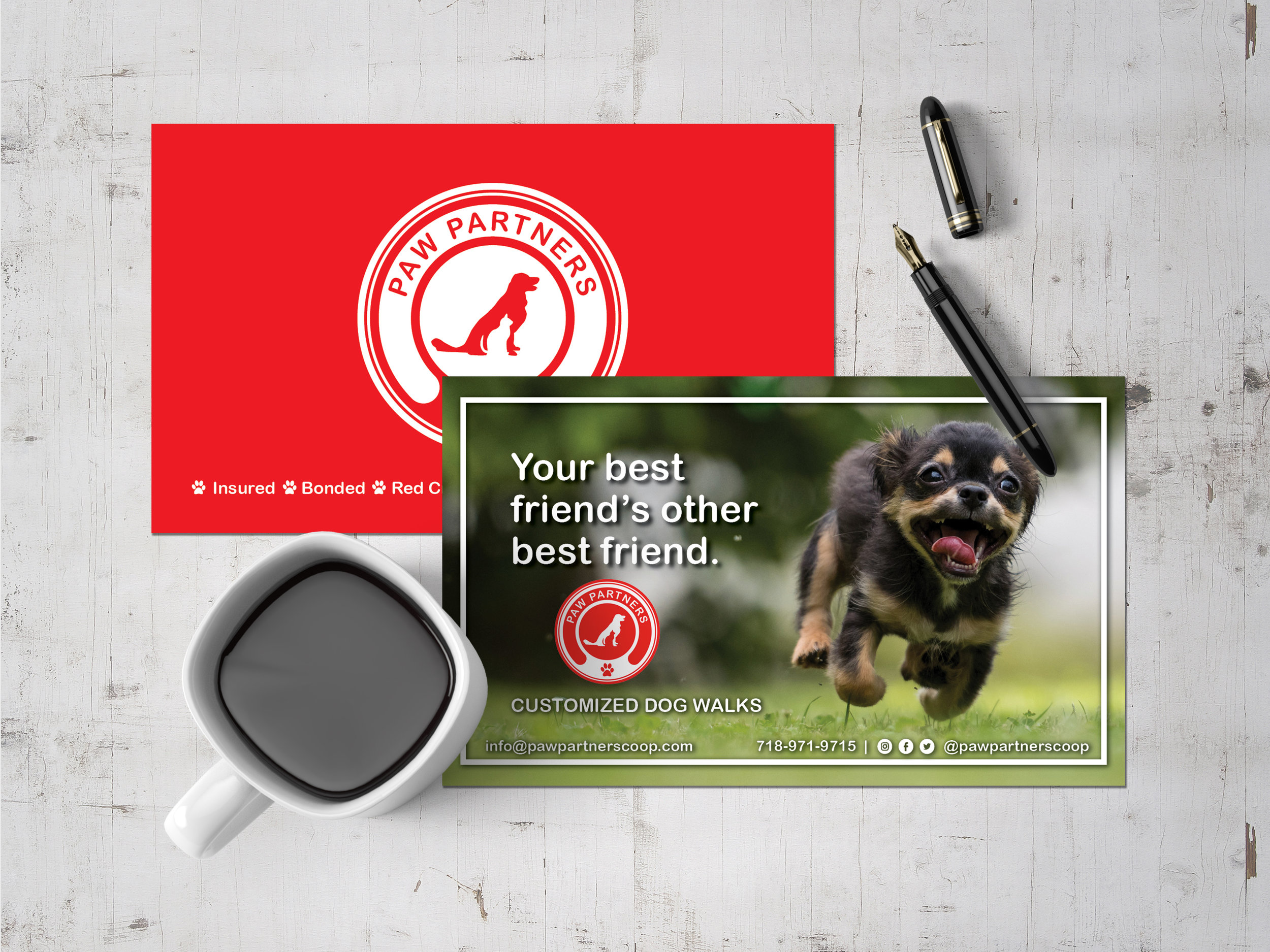
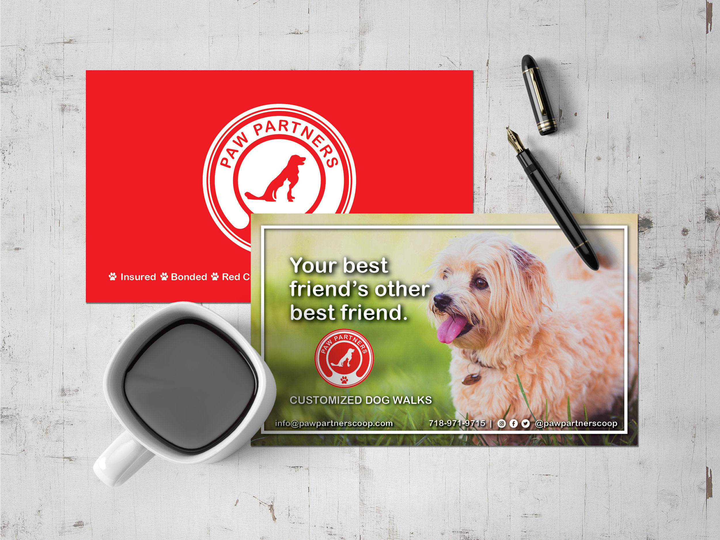
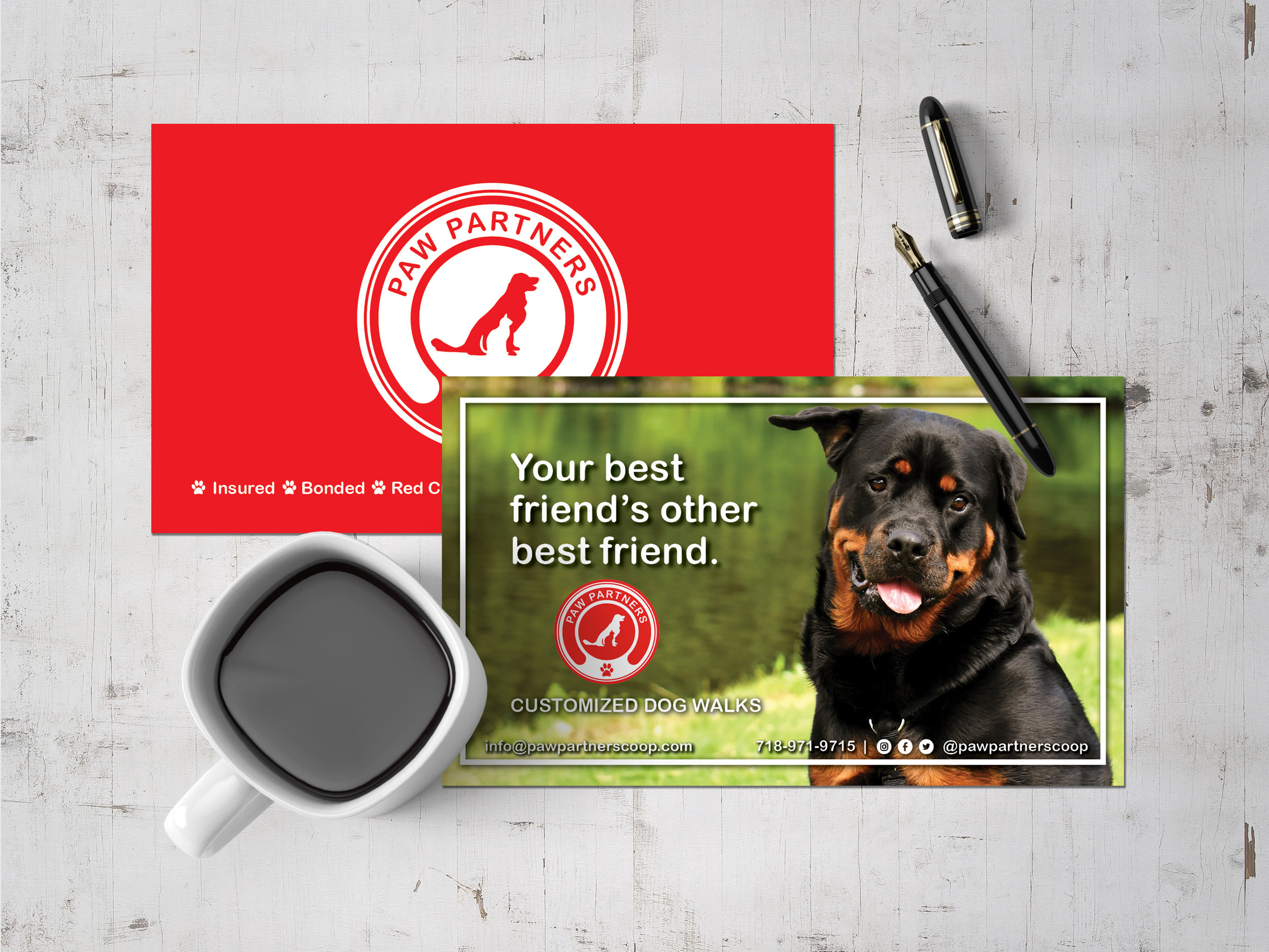
These are the greeting cards I came up with for Paw Partners. Paw Partners is a CO-OP; a collection of workers who pool their knowledge, resources and ownership for the collective company. Paw Partners contracted me to develop their brand identity from the beginning. We started with enhancing their logo by inverting the colors on a simplistic red background. The backs of the cards are simplistic and effective giving them a nice contrast to the cute dog photos on the front. The boarder perfectly frames the dog's portrait. The use of cute dog images draw a connection between the client, paw partners and their furry friends. We designed the cards to be clean and simple and effective. We look forward to developing other promotional materials and websites for the worker CO-OPs!


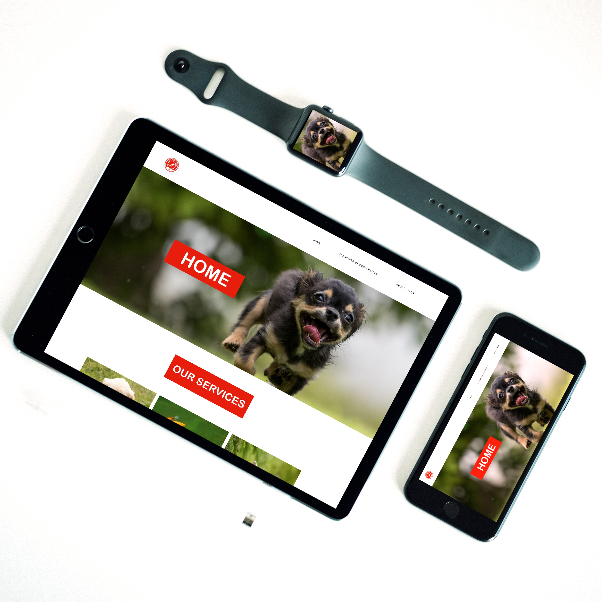
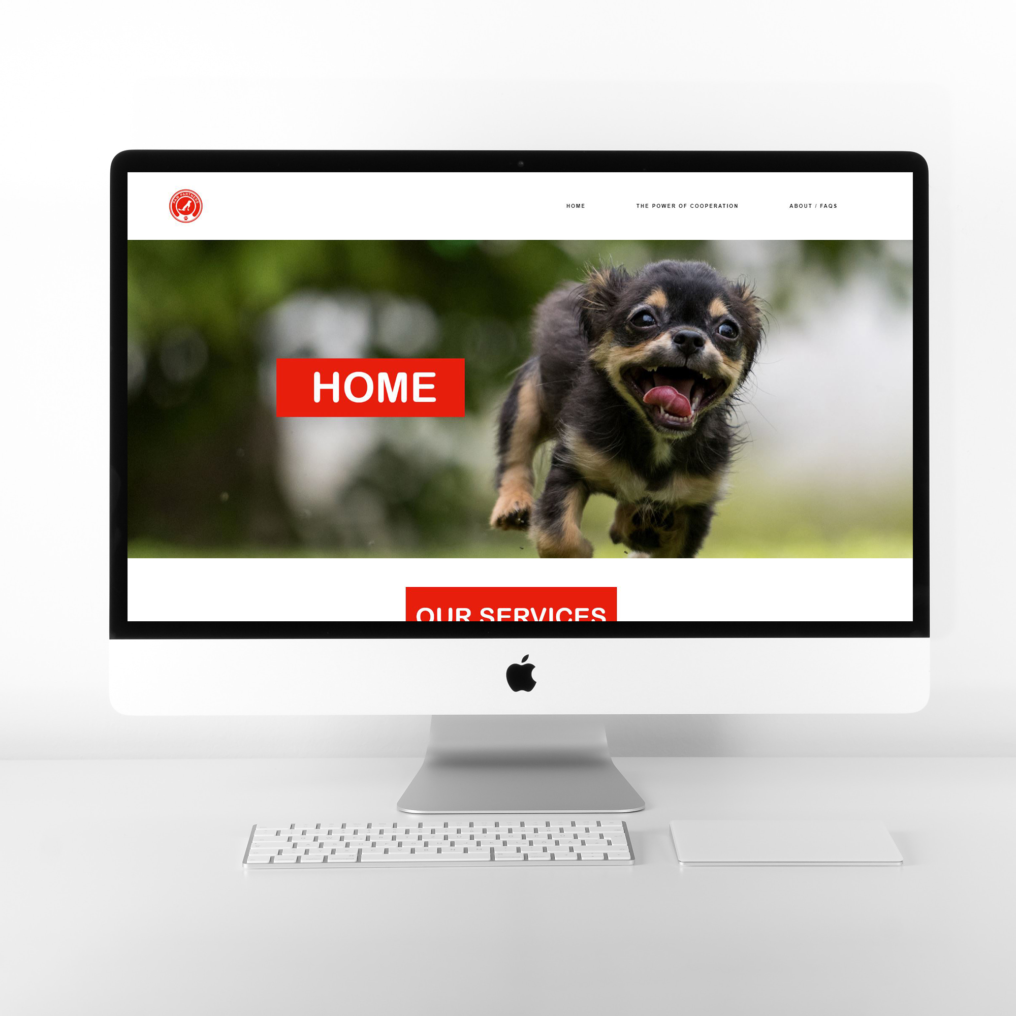
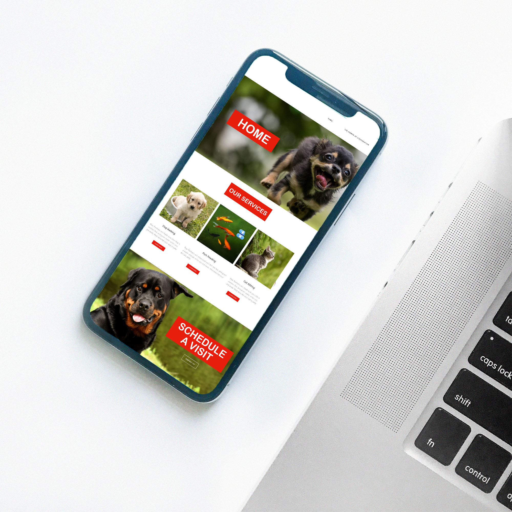
DISCIPLINE: Web Design
CLIENT: Long Island City Paw Partners
DESIGN GOALS:
Create a website for Long Island City Paw Partners.
Create the website to convey the works contact information, schedule appointments, and information in a simple and effective way.
Make the website enhances and develop each companies branding in a fun and exciting way.
SOLUTIONS:
Paw Partners is a CO-OP; a collection of workers who pool their knowledge, resources and ownership for the collective company. Paw Partners contracted me to develop their brand identity from the beginning. We started with enhancing their logo by inverting the colors on a simplistic red background. The website features simplistic and effective layout giving them a nice contrast to the cute dog photos on the front. The boarders, banners and images perfectly frames the dog's cute portraits. The use of cute dog images draw a connection between the client, paw partners and their furry friends. The pets act as the websites mascots. A simple site with matching typography help the site become view-able on all platforms form IPad and phone to laptop and desktop. We look forward to developing other promotional materials and websites for the worker CO-OPs! You can view the website here at https://www.pawpartnerscoop.com/

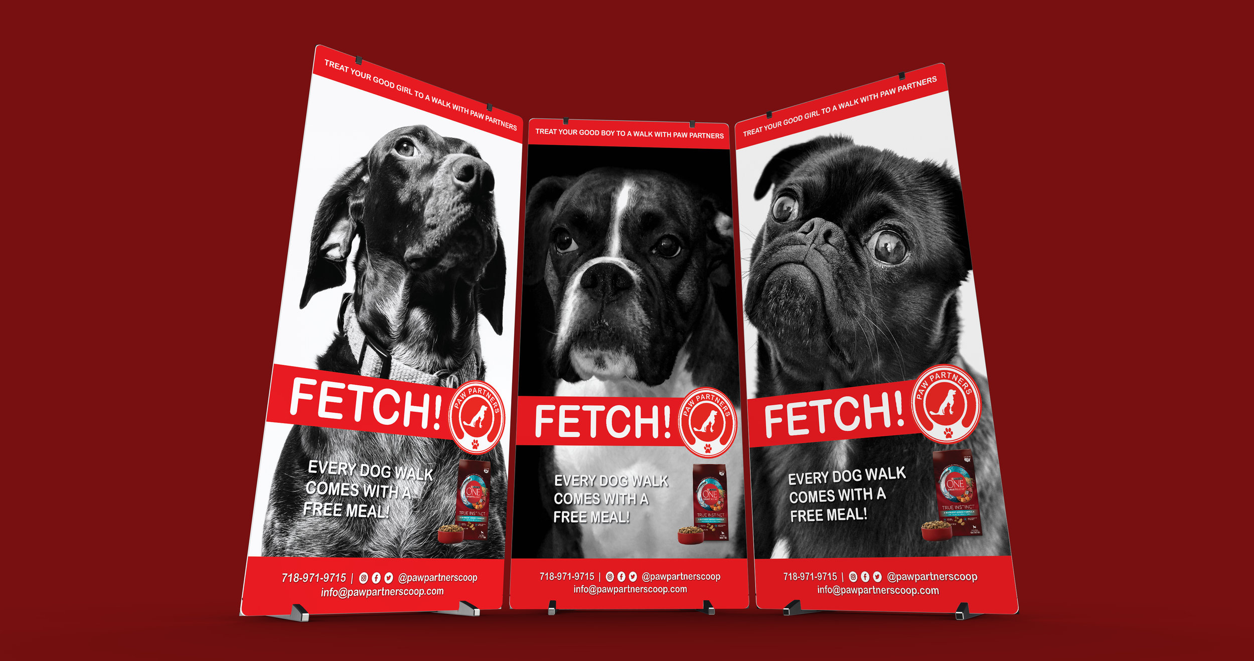
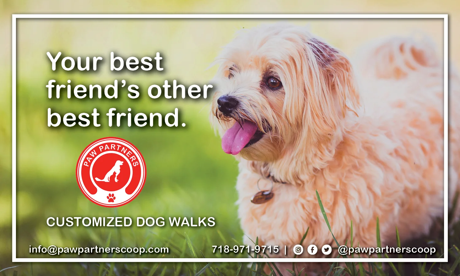
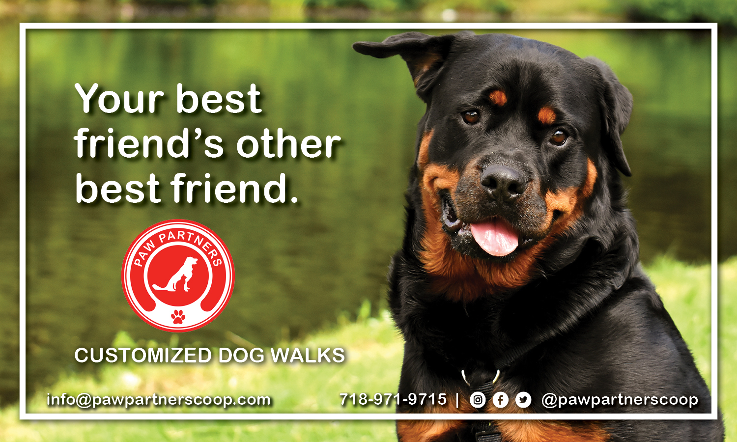
DISCIPLINE: Print Design
CLIENT: Long Island City Paw Partners
DESIGN GOALS:
Create 3 Banners for Long Island City Paw Partners.
Create the Banners to convey the contact information, schedule appointments, and information in a simple and effective way.
Make the Banners enhances and develop each companies branding in a fun and exciting way.
SOLUTIONS:
Paw Partners is a CO-OP; a collection of workers who pool their knowledge, resources and ownership for the collective company. Paw Partners contracted me to develop their brand identity from the beginning. We started with enhancing their logo by inverting the colors on a simplistic red background. The Banners feature simplistic and effective layout giving them a nice contrast to the cute dog photos on the front. The header and footer boarders the images perfectly and frames the dog's portrait. The use of cute dog images draw a connection between the client, paw partners and their furry friends. The pets act as the companies mascots. The typography help the site become easy to read and view from the distance. We look forward to developing other promotional materials and websites for the worker CO-OPs! You can view the website here at https://www.pawpartnerscoop.com/

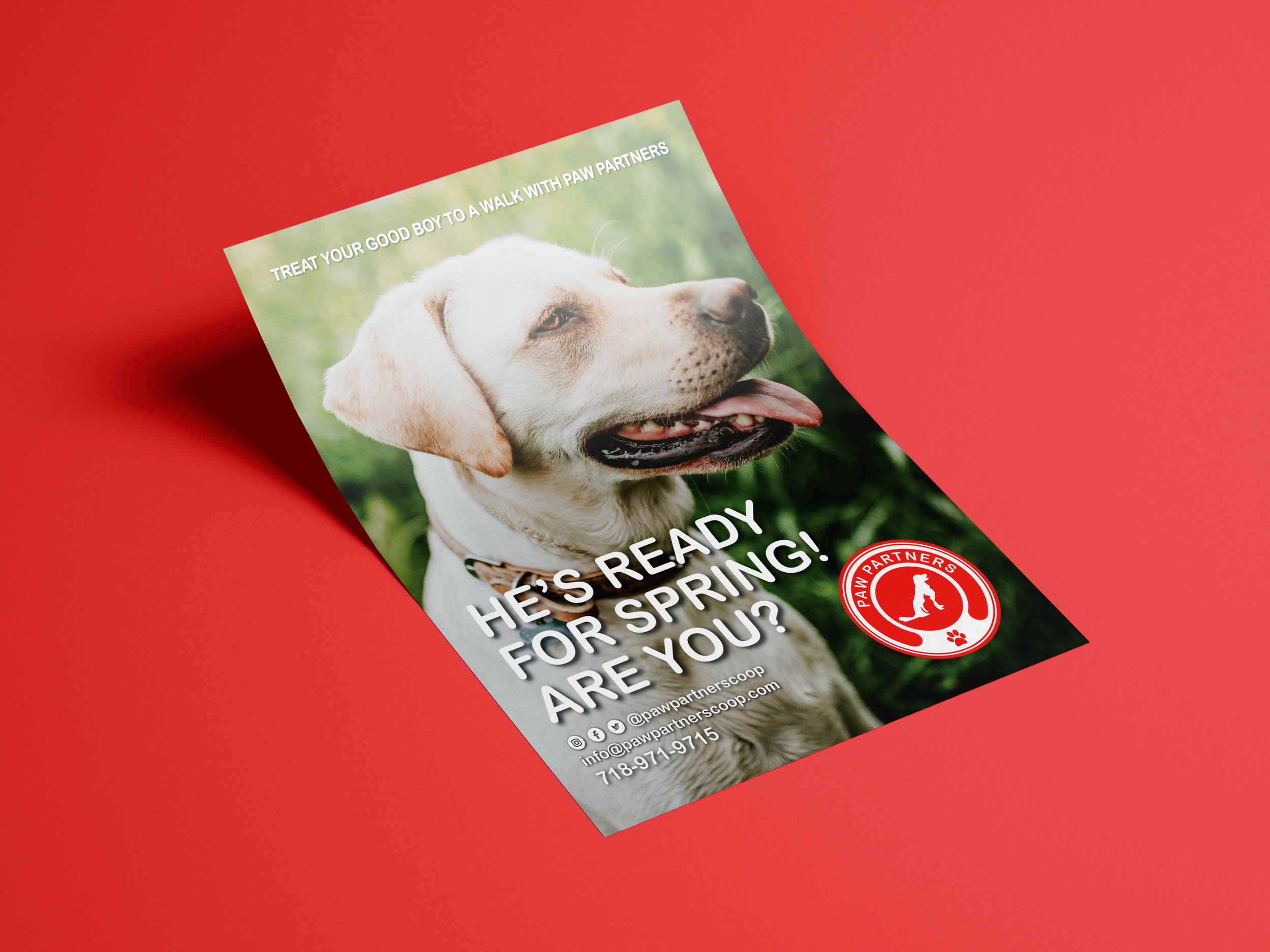
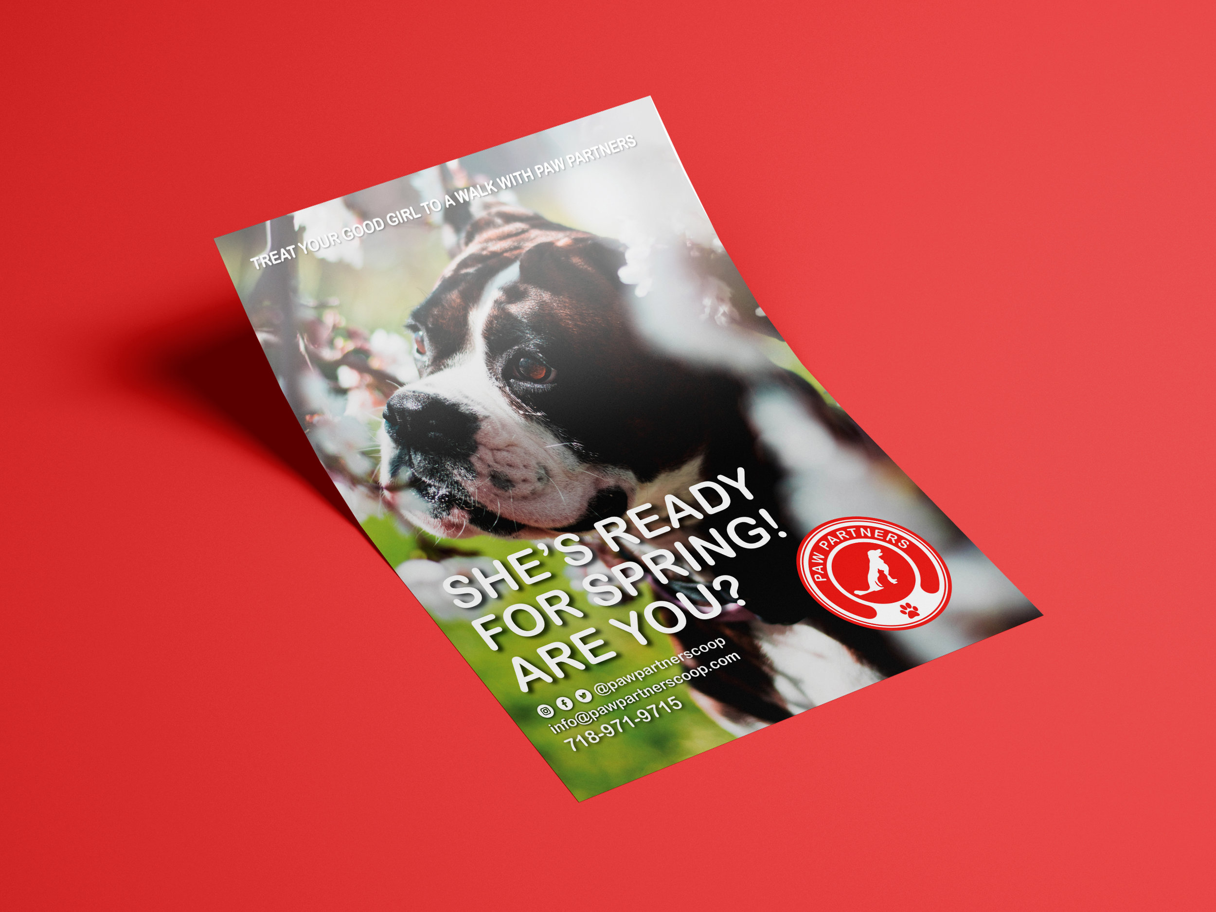
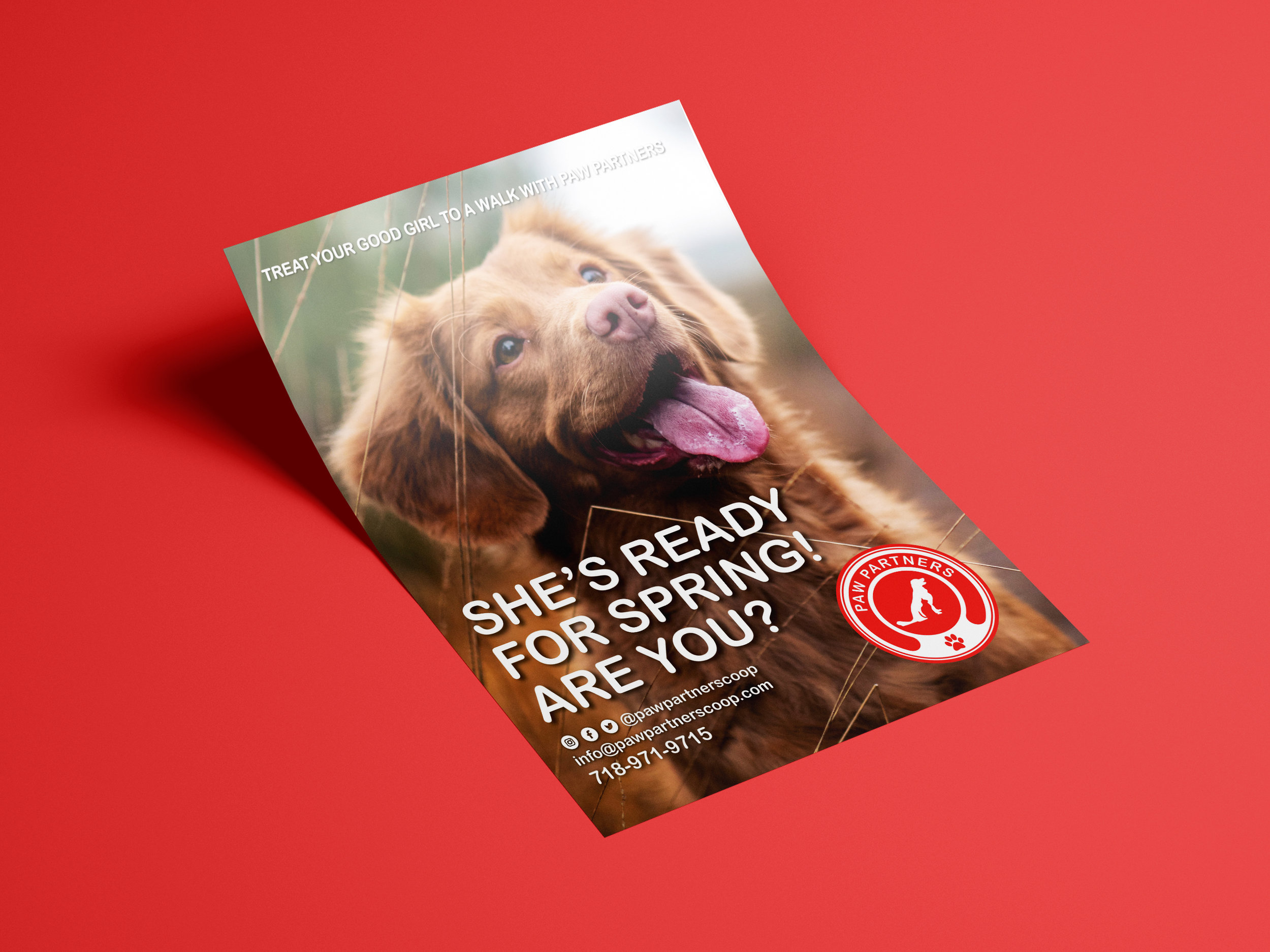
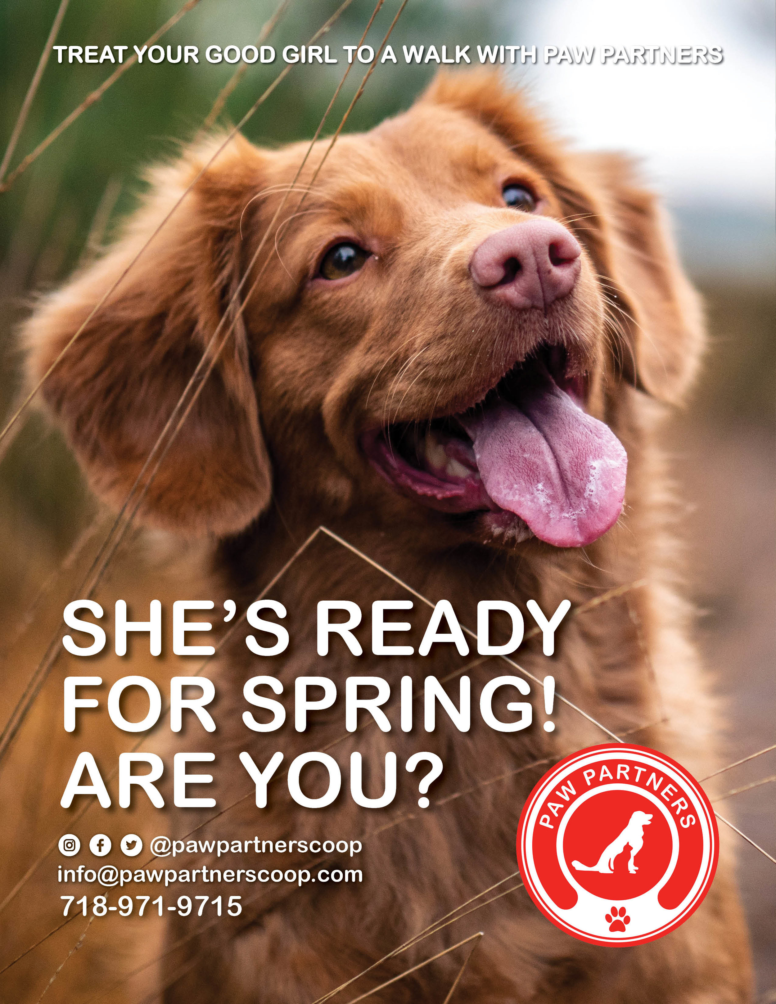
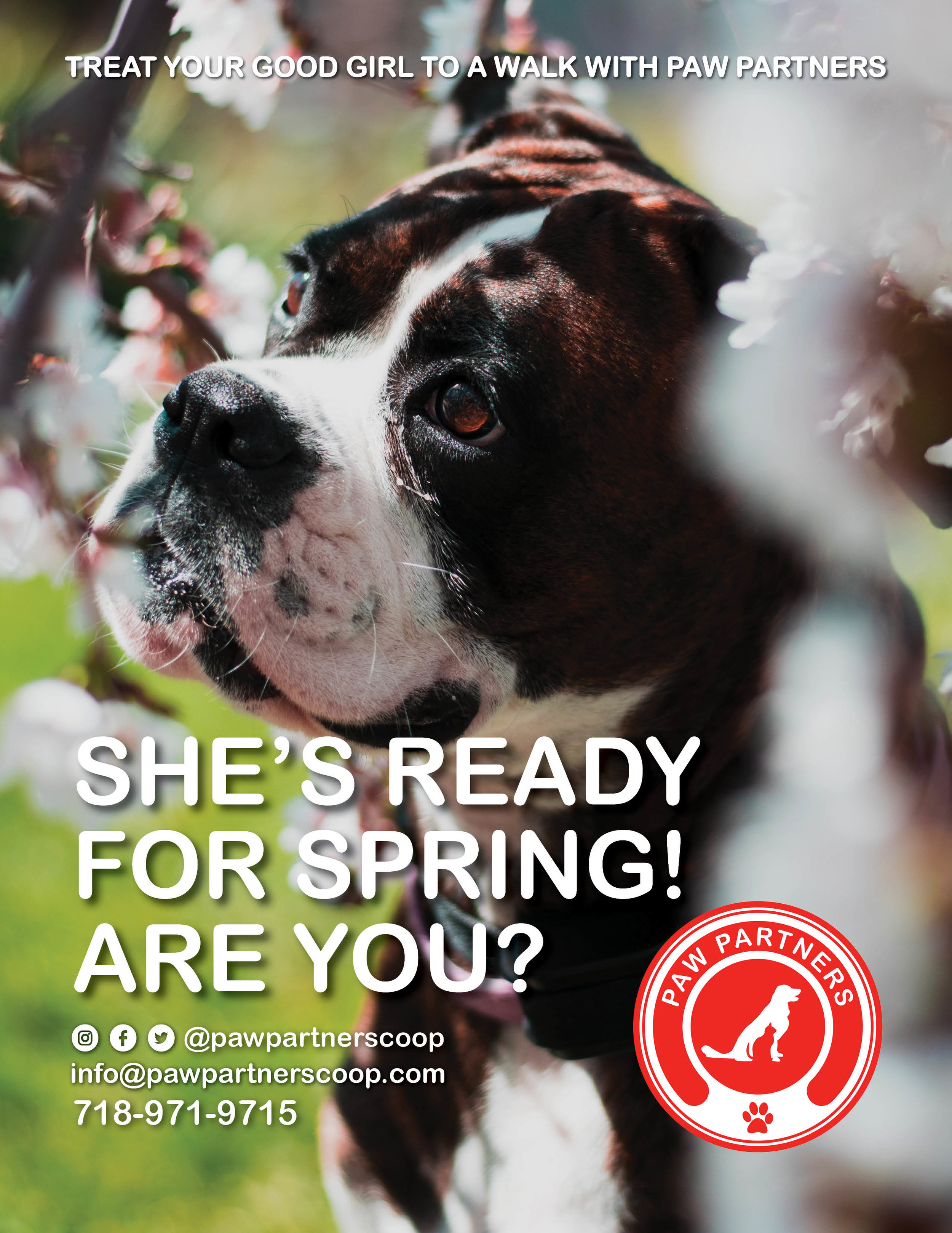
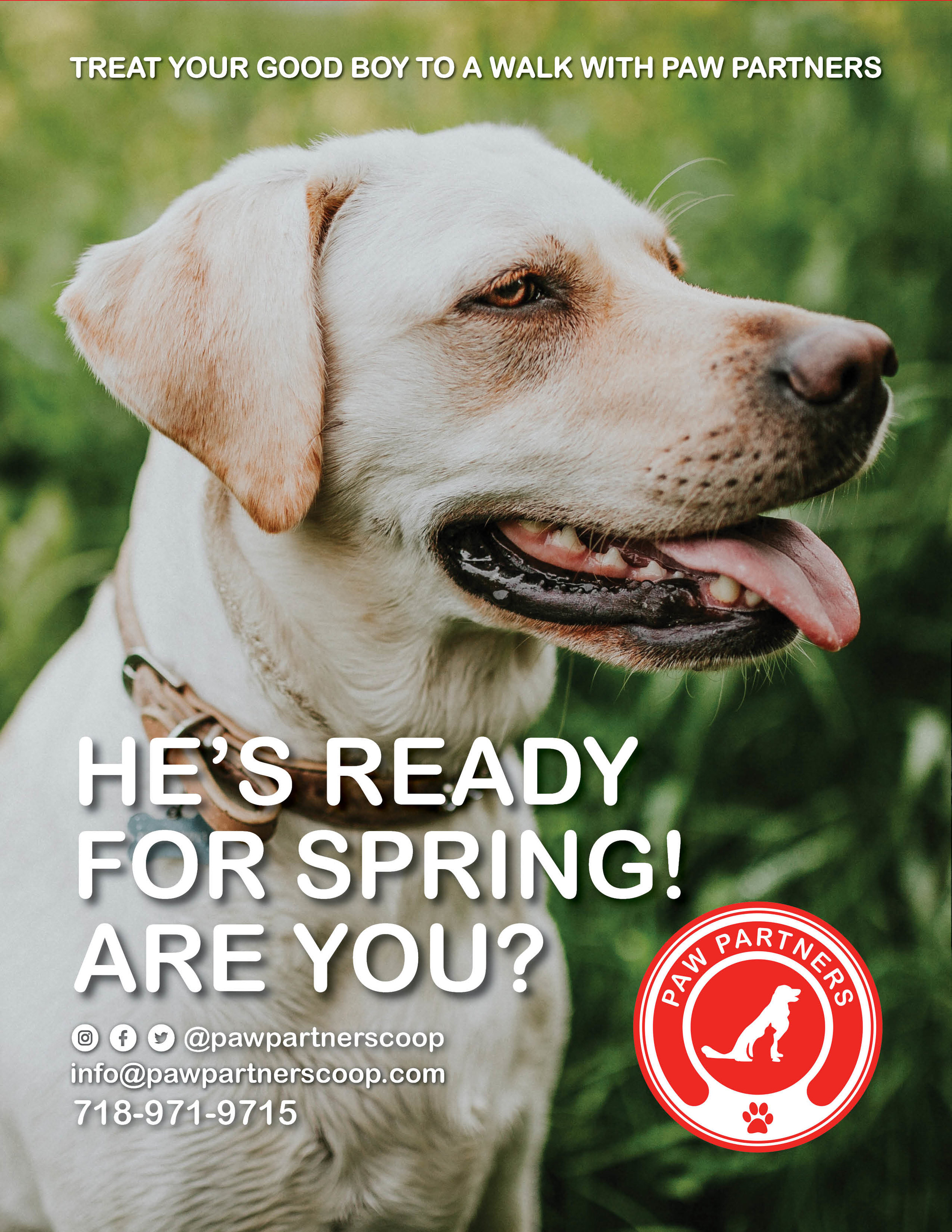
DISCIPLINE: Print Design
CLIENT: Long Island City Paw Partners
DESIGN GOALS:
Create a fliers for Long Island City Paw Partners.
Create the fliers to convey the works contact information in a simple and effective way.
Make the fliers enhance and develop the brand identity in a fun and exciting way.
SOLUTIONS:
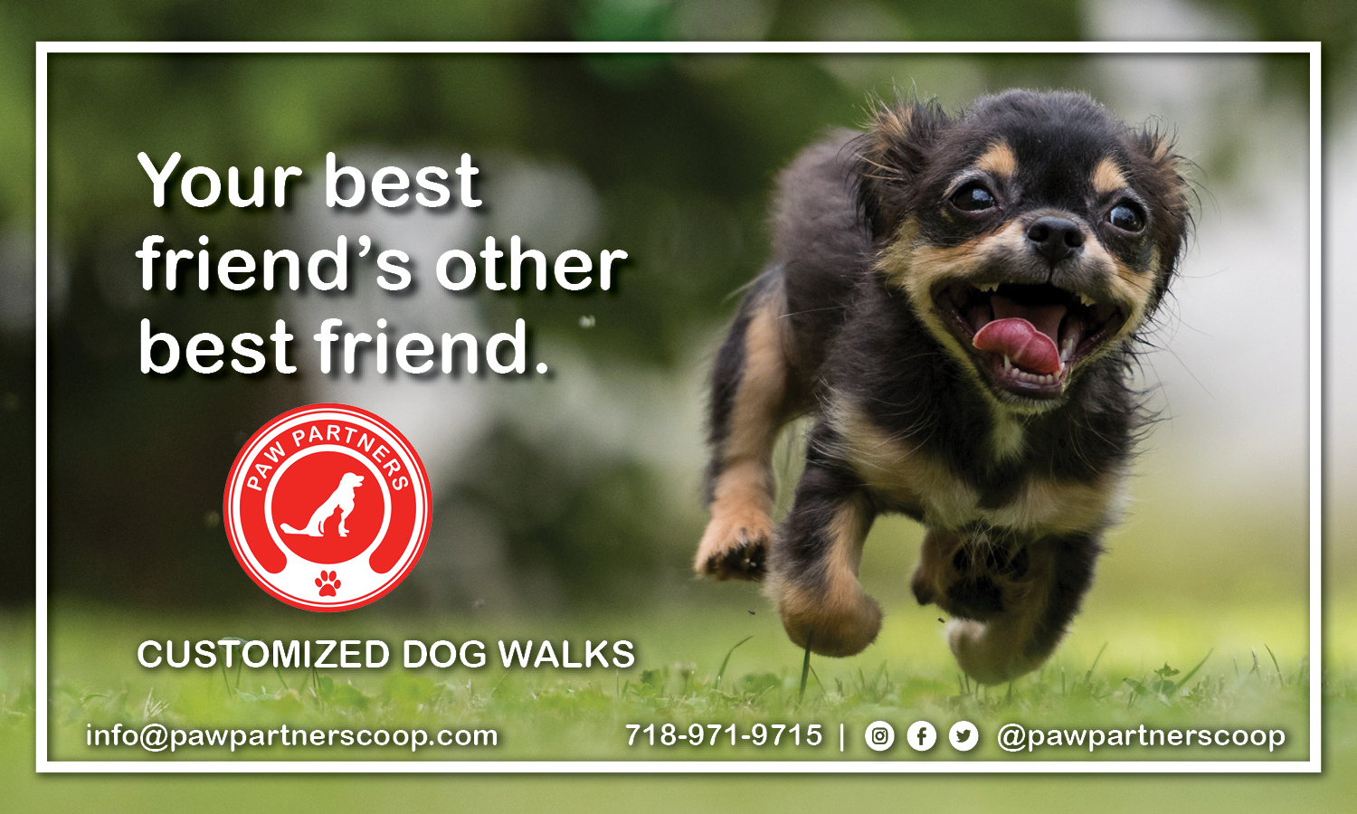
These are the fliers I came up with for Paw Partners. Paw Partners is a CO-OP; a collection of workers who pool their knowledge, resources and ownership for the collective company. Paw Partners contracted me to develop their brand identity from the beginning. We started with enhancing their logo by inverting the colors on a simplistic red background. The backs of the cards are simplistic and effective giving them a nice contrast to the cute dog photos on the front. The boarder perfectly frames the dog's portrait. The use of cute dog images draw a connection between the client, paw partners and their furry friends. We designed the cards to be clean and simple and effective. We look forward to developing other promotional materials and websites for the worker CO-OPs!